In this 5-part series, take a deep dive into universal design concepts in the context of creating component-based systems for dynamic web content. Get a birds-eye view of the inner workings of user experience (UX) architecture. Brand strategy, user psychology, objective methodology, and data-driven decisions come together, guided by timeless fundamental ideas, to construct today’s digital journeys.
Art Direction and Selection for Design Systems: Images, Videos, Illustrations, and Icons
Is a Picture Worth a Thousand Words?
The origin of the notion that images can replace large portions of text is fascinating, as is this study whose findings quantified the average value of an image to be precisely 84.1 words!
But what is a picture on your website worth? While there is, unfortunately, not a straightforward answer, you can get a lot of bang for your buck with strategically chosen images, videos, illustrations, and icons. Read on to find out how to select a masterpiece!
User Psychology and Self-Identification

According to Thinking, Fast and Slow by Daniel Kahneman, a book that explains human thought processes, one of the greatest aspects of our brains is an extensive map of associations that allows us to identify, categorize, and react to everything we take in with our five senses in real-time.
While every individual will have built up a different internal quick-reference guide, because of human and local culture, there is much that we share and many reliable visuals and symbols that can be employed to cue users.
One of the most valuable attributes of an image in a user experience is its ability to help users to instantly “self-identify.” When a user sees a depiction of a person performing a task they wish to accomplish, the thought registers that, “I am in the right place.” The user knows that they have found what they are looking for.
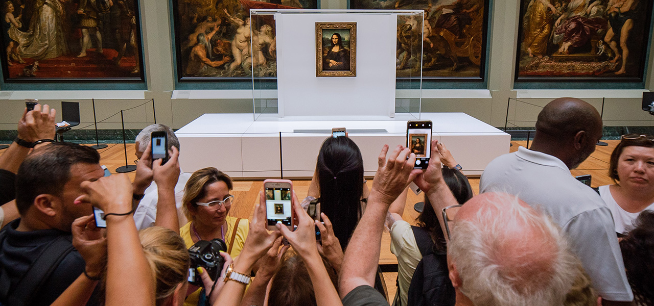
For example, if a web page contains information on nursing licensing, an image of nurses at work would be a great choice for the top of the page. Typically, images containing a human element are preferred. We are especially attracted to faces. Alternatively, an image of hands holding a license would work well. Hands also provide a human element. A third choice could be one or more objects associated with the profession such as a stethoscope, chart, or gurney.
Subtle Emotional Appeal

The robot’s eyes in this image attract attention while its smile conveys an otherworldly friendliness, sparking curiosity.
In addition to self-identification for successful user pathing, striking the proper emotional tone is another important facet in image selection. As a starting point, we can look to brand attributes to provide a list of the qualities that describe the brand’s personality and the feelings the user will experience when interacting with it.
Sample brand attributes include: Innovative, Trustworthy, and Helpful.
Great brands are aspirational. Join the conversation already underway in your user’s mind as they ask themselves:
- Who will I be if I embrace this brand?
- How will I be a better person than I was?
- How will my life improve?
Know the answers and affirm them with every word, every image, and every pixel of white space or color. People buy a feeling not a product, so get in tune with your audience’s subconscious needs.
One of the premises of Thinking, Fast and Slow is that decision-making is at first emotional (fast) and then rational (slow). We tend to make emotional decisions and follow up later with rational justification. A good website will present both the emotional and rational appeals, reinforcing the user’s affinity on multiple levels.
Building an Image Library

A robust website ideally has a robust image library. Content strategy, art direction, and design must take into account real-world editorial factors such as the availability of and budget for assets and the capacity for ongoing graphic design and photography.
An abundant image library will contain multiple selections for the following types of images:
- Long shots (like in the beginning of a movie scene) bring the user into the environment.
- Photos of facilities help the user to visualize the experience they will have should they come to a location.
- Photos of products or objects also cue the user to imagine themselves interacting with the items.
- High-quality placeholder images act as default whenever dynamic content arrives without an image - for example press releases, events, or blog posts.
- But most importantly, photos should contain humans - ideally human faces - because they have the power to:
- Welcome us
- Show us something we aspire to be
- Demonstrate sympathy
- Create connection
- Spark curiosity
- And so much more!
There are many sources for free images around the web to supplement your image library. Unsplash is a popular choice with a large selection and regularly updated.
Responsive Images - Sizing, Aspect Ratios, and Cropping Explained
File this under Frequently Asked Questions: “What size images do we need to provide?” Because websites are responsive, the answer is not straightforward.
Websites are now viewed on a multitude of devices from widescreen monitors to laptops to tablets to mobile phones and more. Components act as flexible containers for content while pages act as flexible containers for components. Both are programmed to “respond” to the width of the viewport in different ways.
Because of this baked-in flexibility, there is no one size at which an image will be displayed. The important number to know in terms of image size is the maximum width at which it will be displayed. Multiply that by 2 to achieve HD resolution.
A second crucial number to know is the aspect ratio. If the component is programmed to maintain the aspect ratio across all breakpoints, then you will always see the same visible portion of the image. Knowing the aspect ratio allows you to use the max width value to calculate the max height. A user-friendly system will fit the image inside of the display container and crop off the excess be it width or height.
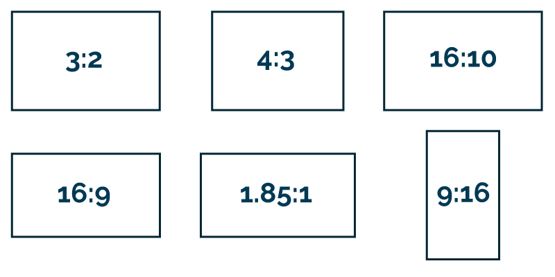
Common aspect ratios include
- 3:2 - Photographs
- 4:3 - Laptop monitors
- 16:10 - Widescreen monitors
- 16:9 - YouTube videos
- 1.85:1 - Movies (US)
- 9:16 - Smartphones (Vertical)
But some component designs might, for example, present a landscape image for one component or on one device and crop that same image down to a square elsewhere. In that case, you want to be certain that the focal point of the image is positioned well for both presentations.
Programming - such as the Focal Point module - can be added to help content authors automatically detect and customize image focal points for savvy cropping across components and devices.
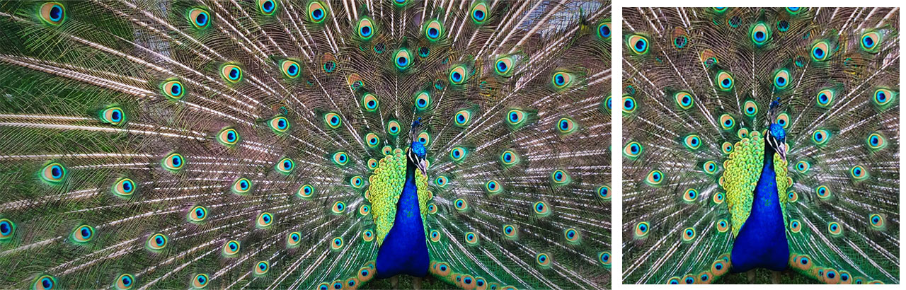
Selecting a focal point allows images to be cropped to the subject. This is easier than having to source or produce images that always have the subject positioned in the same location.
Accessibility and Alternative Text
Image accessibility is fairly straightforward most of the time. The WCAG standard 1.11 for non-text content requires that “All non-text content that is presented to the user has a text alternative that serves the equivalent purpose.”
Typically, alternative text should be limited to 150 characters or less, should describe the image succinctly but adequately, and should never be stuffed with keywords. See webaim.org’s excellent guide to alternative text for full details.
Making alt text a required field for images in the image library is an easy, automated way to help insure compliance. Don’t underestimate the time it takes to write proper alt text. Depending on the subject of the image, this could be quite an undertaking. Writing alt text for artwork, for example, is especially challenging.
Moving Images - Videos on the Web
Well-made video content can be a great addition to or even one of the primary focuses of your website. If a picture is worth a thousand words, moving images allow you exponential ability to showcase emotions, facilities, products, brand attributes, and more.
Indeed, the majority of users (from 60-70% depending on the study cited) prefer video content when learning about a product or service, with some important caveats. Forbes reported on a Verizon Media study of US consumers whose findings included the following:
- 69% view video with no sound in public
- 25% watch with no sound in private
- 80% are more likely to watch the entire video when captions are available
- 50% say captions are important because they watch video with sound off
Including captions with your video content serves the majority of users’ needs.
Accessibility for Video Content
Accessibility for video content can be divided into two categories: videos with audio and videos without audio.
For videos without an audio track, be sure to include proper alt-tagging as with images. Autoplaying the video is OK, but include controls to stop the movement.
For videos with an audio track, include captions, audio descriptions, and transcripts. Use autoplay only sparingly and mute sound by default if autoplaying. Include controls to stop play.
For further details and a plethora of links to additional resources, check out the WC3’s Multimedia Accessibility FAQ.
Illustration Nation

Previously relegated to an afterthought on the web, illustration has been up and coming for some time now but is still a refreshing addition to any design system. Illustration has the power to convey brand color, humor, diversity, and feelings in a unique way.
There are some fun resources for generating custom illustrations such as Blush and Humaaans that are worth looking into. UnDraw is an open-source repository for illustrations that allows you to customize colors to match your brand.
The Devil in the Details - the Joy of Icons!
While icons are indeed miniature illustrations, their magic lies in the fact that they come in a set. Similar to fonts in many ways, a quality set of icons contains consistent shapes, lines, and spacing. These simple building blocks are combined to create tiny abstract elements to convey ideas at a glance. These ideas can sometimes be quite complex!
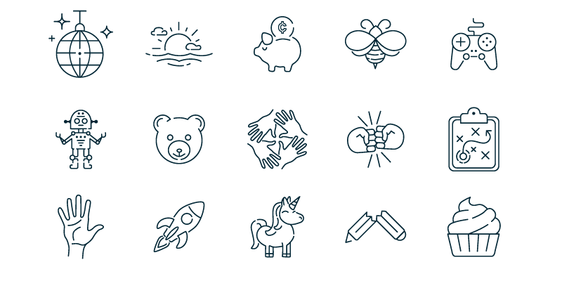
Some robust and popular icon sets include Font Awesome and Streamline. A selection of our own hand-drawn icons has been released into the public domain on The Noun Project’s website.
Art Direction for the Web - Keeping the Big Picture in Mind
As hinted at previously, there are three stops on the journey of art direction for a new or redesigned website before the first pixel is committed. It is important to study, establish, or re-establish the following in the planning stages:
- Brand standards
- Editorial process
- User testing data
A website’s artwork is a galaxy in a much larger universe. So the first step is to chart your position on this map. Learn the brand and expand it where you can. Understand the constraints of the folks who will be producing the content day after day. Get familiar with the user base through surveys, interviews, A/B tests, and more.
Look to the future. Plan on collecting feedback and iterating after launch. There is no better source of knowledge about how a website is used and where pain points lie than its users. Tune in to what they have to say and you can give them best-in-class experiences.
To learn about an array of other UX topics, check out the first four parts to this 5-part series. In part 1, learn about visual grammar as a UX strategy. In part 2, explore the art of crafting language to inform, guide, and delight users. Part 3 is all about the design principles behind building flexible typographic systems for the myriad of screen sizes out there today. And in part 4 we discuss how design systems ensure a consistent experience and make ongoing enhancements much easier for years of dynamic, user-entered content.