Want to reach a broader audience? You are not alone! Outside of the digital space, savvy planning can ensure that a product or service is usable by as many humans as possible by removing barriers and creating intuitive tools and welcoming spaces. Although websites offer a virtual rather than a physical experience, there is much to be learned from environmental design.
Building a website that informs and guides users on all of their possible journeys is similar in many ways to designing a public transportation system or even a theme park. Moving beyond accessibility, the next generation of web design is approachable, inclusive, and as a bonus ready for search engines and future tech.
Universal Design
“The evolution toward Universal Design began in the 1950s with a new attention to design for people with disabilities. In Europe, Japan, and the United States, barrier-free design developed to remove obstacles in the built environment for people with physical disabilities.”
Source: Institute for Human Centered Design
A great example of Universal Design is the sloped curb. Designed by Selwyn Goldsmith in the 60’s, it is now a standard feature of the built environment that is aesthetic and usable to the greatest extent possible by everyone, regardless of their age, ability, or status in life. Although designed with physically disabled individuals in mind, it is quite handy to those folks pushing a hand truck, riding a bicycle, pulling along luggage, and more.
Barrier-Free Virtual Spaces
Just like sloped curbs, small adjustments to the virtual experience can open the door for a wider audience. While accessibility standards address specific impairments, inclusive design encompasses these while smoothing the way for many user conditions and variations.
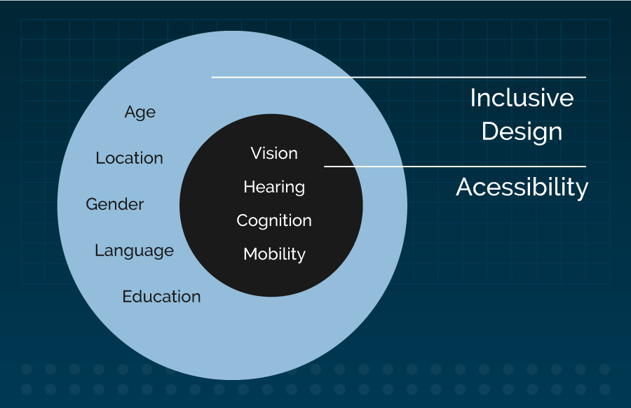
Shout out to Mike Miles for the inspiration for this graphic, and other concepts herein.
Sandi Wassmer’s 10 Principles of Inclusive Web Design sum up guidelines for taking a user-centered approach to architecture and industrial design into the digital area. Flexibility and simplicity are emphasized, as well as the impetus to be effortless and accommodating.
It’s as if you are hosting a big party and want all your guests to enjoy themselves. The guest list for a website is hopefully quite extensive, so we typically create personas to capture the various audiences for content.
Personas With Limitations
A good way to bake Universal Design into a project is to create personas with limitations to help guide thinking around removing the barriers that each may encounter on their journeys. Here are some examples:

Slow internet connection
Leroy, a frequent business traveler based in Atlanta, often has to work while waiting to board a flight at Hartsfield-Jackson Airport, where the average downstream speed is 2.68 mbps.
According to Fastmetrics, the average internet speed in the United States is 14.2 mbps. However, the global average is much lower at 7.2 mbps, with some locations struggling with load times of 0.5 mbps.
Principle: “Be Flexible”
We can help to support this persona by serving up text content first and images later. We can show alt tag text while images are loading. We can provide a spinner or similar indication that the website is sending or receiving data.

Temporary disability
Sarah, a marine biologist from Cape Cod, MA has developed carpal tunnel syndrome and greatly appreciates websites where she can handle her business online with as few clicks as possible.
According to the ACR, carpal tunnel syndrome is possibly the most common nerve disorder experienced today. It affects between 4 and 10 million Americans - approximately 3% of the population - in any given year.
Beyond the 1 in 5 persons worldwide who report having a permanent disability, temporary conditions add to the number of differently-abled users.
Principle: “Be Simple and Intuitive”
Even users experiencing no physical limitations prefer interactions that feel effortless. Every feature, every step should add value and not just complexity. Technology is meant to make human lives easier.

Color blindness
Drew, a developer from New Orleans, has Tritanopia. He can’t distinguish between blues and greens and has trouble reading when the combination of text and background is low contrast.
Did you know that there are 8 types of color blindness? It can be counter-intuitive to account for all of the variables. Fortunately, there are a number of testing tools to facilitate this task and create a color blind-friendly palette.
Principle: “Be Perceptible”
Beyond achieving compliant levels of contrast, aim to support all users, including those approaching the site without visual cues of any kind. While for now at least, this is not the majority, you’d be surprised how much website traffic is non-visual.
Search Engines and Voice Interfaces
“Your deafest, blindest user is Google”
- Mike Miles
Google navigates websites using the same guideposts assistive technologies use. These robots “see” websites via hidden tags. They “read” content just like a screen reader does. Proper organization and tagging not only enables assistive technologies, it optimizes SEO.
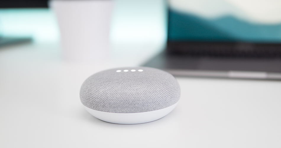
And don’t forget that our new robotic friends Siri, Alexa, and other voice-activated assistants are becoming more prevalent because they are affordable and convenient, offering users a non-visual, hands-free way to get information and perform tasks. This emerging technology takes in websites just like Google does, reads text to users to answer their questions, and allows them to take action with spoken commands. Thoughtfully written content and supporting tags are key to making voice interactions successful.
Behaving Like Helpful Humans
Google, Alexa, and all of your human users benefit from clearly written language. The recommended target reading level for content is 6th grade. Tools such as Hemingway Editor help you to craft bold, concise verbiage.
Nest your copy in user journeys that will work for all personas, at all screen widths. Provide contextual relations, consistency, and workflows that can be followed even without visual cues.
And who says pithy instructions can’t be conveyed in a friendly tone? Two of Wassner’s 10 Principles are “Be Preventative” and “Be Tolerant.” Clear directives minimize errors, but the greater opportunity is to build trust. Treating people respectfully when they interact with your website generates confidence and connection to your brand.
You can help users feel supported by speaking graciously when guiding them through interactions, rather than simply robotically listing the steps. Providing accessible form labels is of great import, as are helpful error messages. If a party guest knocked over the salsa dish, you wouldn’t want them to feel too bad about it! Websites are “hosted” by the invisible person that is an amalgamation of all the copy you put forth, even down to the tiniest detail.
This party host represents your brand in the virtual space just like the actual people who interact with your users in the real world each day, so be sure to set the appropriate tone. Then take it to the next level and personalize the experience by serving up individualized content and suggestions and a simple website becomes a sought-after destination - a helpful human-like presence!
Lastly, be sure to get feedback, conduct user testing, and iterate to meet user behavior and expectations. By testing your assumptions and making adjustments, you can hone the brand experience.
Welcoming Diversity
“People must be represented in public spaces. Placemaking puts a particular emphasis on engaging many different stakeholders, listening to their stories, and making recommendations reflective of their specific concerns and desires.”
Source: Project for Public Spaces
Research has revealed that branding diversity can actually negatively affect diversity by creating an “illusion of fairness.” Rather than directly touting a company’s or organization's commitment or specific programs, strive for a more subtle, authentic approach.
At the outset, a diverse team of designers and developers provides a rich foundation by bringing multiple perspectives into the build. Internally, recruit a varied set of content creators to help engage a wider audience.
Be purposeful in featuring content that celebrates a broad range of cultures and perspectives. Highlight content from diversified sources to create a robust community. Use inclusive language.
Tell a myriad of stories, and don’t forget the power of imagery. People will feel more comfortable when they see people who look like them represented, and less welcome when they do not, so showcase a wide variety of folks. Question all assumptions at every turn - we don’t all have the same capabilities or lifestyles. We don’t all celebrate the same holidays, and that is OK!

Accessibility standards are now applied to the virtual environment. Universal design goes hand in hand with inclusive design. And with a little mindfulness and forethought, we can not only design digital spaces that have plenty of room for all different kinds of humans, but we can connect with them and make them feel at home, expanding reach to encompass everyone.