
Why does mobile-friendly matter?
User acquisition, retention, and engagement
Worldwide, right now, the majority (over 51%) of users are visiting websites from mobile devices, and this number is trending ever upward. Americans now spend an average of 5 hours per day on their phones. What are users expectations when they come to your site on their mobile device and what happens if you aren’t meeting them?
You lose them.
According to Google, 53% of visits are abandoned if a mobile site takes longer than 3 seconds to load.

Sites that load within 5 seconds boast
- 25% higher ad viewability
- 70% longer average sessions
- 35% lower bounce rate
Search engine ranking
Following responsive, mobile-friendly design best practices is becoming more important than ever in influencing search engine rankings with Google’s recently-announced shift to “mobile-first” indexing. Because the majority of people who use Google search today now do so from mobile devices, and have done so since 2015, Google is moving to prioritize mobile-friendly websites.
Even if your customer base doesn’t favor mobile, this change applies to you: Starting in July 2018, slow-loading content will be down-ranked.
This change is coming slowly but inevitably. How can you prepare? How can you make your website more mobile-friendly?
Rest easy! There are many tests, tools and analytics available. There are tried and true user interface (UI) patterns, and established best practices. Changes can be integrated over time on an existing website, or baked into a redesign project. But first...
What does mobile-friendly mean to a user?
A fast and easy experience
Users want what they want and they want it now. They expect pages to load immediately, and they want mobile-friendly, app-like features such as
- Big buttons
- Simple input boxes
- Limited pinching
According to the Google report, “What Users Want Most From Mobile Sites Today,” users want quick access to information like prices, hours, directions and contact numbers. Any supplementary information or functions need to be easily digestible and immediately useful.
What does mobile-friendly mean to a business?
Return on investment of UX design
While some may think that design is purely about aesthetics, look and feel is only the tip of the iceberg of a holistic, multi-channel interaction with a brand. From social media, to visiting a physical location, to calling customer service, to opening a carefully-designed package, to pulling up a website on a mobile device - each of these touchpoints along the user’s journey should share the same voice, communicate the same values, and function flawlessly.
Professional UX design takes the entire customer journey into account, leverages proven methodologies and interaction patterns, and helps to build and test strategic initiatives, targeted to the users of your website. The benefits can be measured in improvement to a wide range of metrics such as lead generation, user retention, customer loyalty, and user productivity.
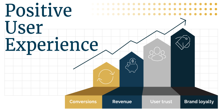
Increased conversions
Increased conversions, increased sales, and lower bounce rates can all be tracked in Google Analytics. Peering into this window allows us to see if users are leaving certain pages more frequently on mobile than on desktop. That helps us to determine the places that need the most attention on mobile. Improved design will have a positive effect on these KPIs.
Long-term user loyalty
UX design is a powerful way for businesses to display their company’s commitment to the quality of their products and services. The attention to detail and smoothness of experience that a user encounters on a company’s website sets the stage for interactions in all other channels.
What’s more, a bad mobile experience can not only cost you one customer, but many. According to Google’s Mobile Playbook,
- 40% of users have turned to a competitor’s site after a bad mobile experience
- 57% of users say they won’t recommend a business with a poorly designed website
Reduced long-term costs
Mobile-first design plays an important role when taking a “measure twice, cut once” approach to website projects. Compared to the costs and challenges with retrofitting responsive design after a site build, a UI that takes the entire range of viewport widths into account from the start is much more economical.
Bottom-line impact of page load
Businesses that increase their page load speed report measurable changes in numbers
- Increased conversions
- Increased revenue
- Increased pages per session
- Decreased bounce rates
Here are some example case studies from WPO Stats that demonstrate the business value of Web Performance Optimization.
What can I do to make my site more mobile-friendly?
Optimize page load speed
Here is a tool to check how fast your site loads.
“Make sure they [web pages] load fast, for your users. I aim for less than 2-3 secs”
Every additional second of loading time results in a 7% reduction in conversions. The number one reason for slow load time is images that are not properly sized and optimized.
Optimize user experience
This is an especially broad topic, so here is just a quick overview of some design best practices for responsive websites that can be built into a new site, or added to an existing site, to make it more mobile-friendly, compelling, and easy to use.
Keep menus short and sweet
Too many menu items, too deeply nested, will quickly lead to user confusion and task abandonment. As a general rule for many websites, keep navigation from going more than 2-3 levels deep. Limit the options for each tier to 5-7 menu items at most.
Streamline the mobile navigation pattern
Think beyond the hamburger menu. While it may indeed be the right answer for your website, be sure to consider the options, such as icon-based tab-bar navigation. If a primary action button is in play (such as Book Now or Sign In), be sure it gets rock star parking on all relevant pages. For example, consider an ever-present floating action button.
Keep primary content front and center - and at the top
While the dated concept of keeping everything “above the fold” is now a myth, that does not mean you shouldn’t prioritize primary content and actions. Users scan content in an F-pattern. If what’s above the fold isn’t compelling enough, users won’t bother scrolling to see what else there is.
Segment and optimize content
Keep it brief (or at least offer a summary). Mobile users tend to be more distracted, and because of that, shorter “chunked up” and “snackable” content often works better for them. One way to offer them the salsa of brevity, but still offer the long-form content Google loves is to offer a summary. Summaries most often appear as the first paragraph.
Make forms easy to complete
Streamline information entry by automatically advancing to the next field when a user presses return. Provide suggested values for a field. Provide visual calendar for date selection. Label fields clearly and validate in real-time. Break up long forms as you would with any content. Consider progressive profiling to break up the collection of user data over time.
Beyond the basics: What can I add to engage, retain, even thrill mobile users?
Personalization is everywhere, and is even starting to become expected by savvy users. Get started by considering location or persona based targeting.
Take cues from the app world and incorporate touch gestures, feedback, and microinteractions in mobile components.
Last but not least, never underestimate the power of "delighters” to reach out to users, and win their hearts. These unexpected touches can be as simple as clever microcopy, captivating animation, unexpectedly elegant transitions, or well-selected images, icons, or illustrations. What delighters make sense with your brand?

Read more about Mediacurrent’s design process for creating a set of our own often-delightful and extremely useful on-brand icons.
What’s the next step?
A mobile-friendly website is clearly a must. But what is the roadmap to optimization? Where are the bigs wins? What solutions will mean the most conversions?
We recommend mobile-friendly, responsive design with load time optimization, and a solid strategy to assess and improve content quality. User test whenever feasible, prior to major roll-outs. Create benchmarks and track analytics to see the effects of any adjustments made, watching for changes and trends. Run campaigns to A/B test different approaches and discover which one converts more.
At the end of the day, the good news is that for many websites mobile optimization can be accomplished iteratively, and the areas of greatest opportunity can be discovered with analytic reports and prioritized. Once addressed, these adjustments will have demonstrable results. With one eye on the incoming data, another on current and long-term goals, and a finger on the pulse of emerging technology and industry trends, the value of digital investments can be maximized.