“There are only two hard things in Computer Science: cache invalidation and naming things.” - Phil Karlton
Well, I don’t know much of anything about cache invalidation (I know someone who does though!) but I can tell you from experience that naming things is definitely HARD.
With a shared vocabulary, designers and developers can more easily collaborate with each other and move between teams and projects without having to learn an entirely new language. Over time, we have come to recognize and utilize a lexicon of terms that we collectively understand.
As a full-service digital agency, we have teams that concentrate within a wide variety of disciplines – from digital strategy to design to backend development and beyond. While we may be grouped together by discipline, day-to-day we’re most often working with cross-functional teams concentrated on solving specific problems for a variety of projects and clients.
Without further ado, I present you with Mediacurrent’s glossary of web design terms that we use to reference the different bits, pieces, and aspects of our projects. The first section includes general terms we use day-to-day. The second half describes common components, which work like individual building blocks of pages, that we use from our creative team’s component library, otherwise known as Rain.
General Terms Designers and Developers Use
Atomic Design
A methodology created by Brad Frost for breaking down the parts of your website using a chemistry analogy of atoms, molecules, and organisms that allows designers and developers to roll out higher quality, more consistent user interfaces quickly and efficiently.
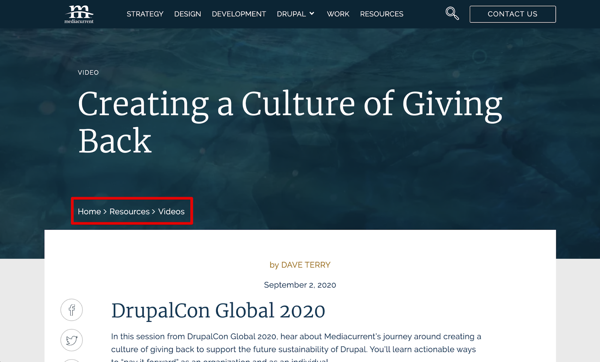
Breadcrumb
A more common term, breadcrumbs are a string of links displayed near the top of a page that act as an index of sorts helping to orient the user to where they are in relation to other pages and sections of the site. They are also often hyperlinks, providing a secondary form of navigation to users.
Breadcrumbs on mediacurrent.com
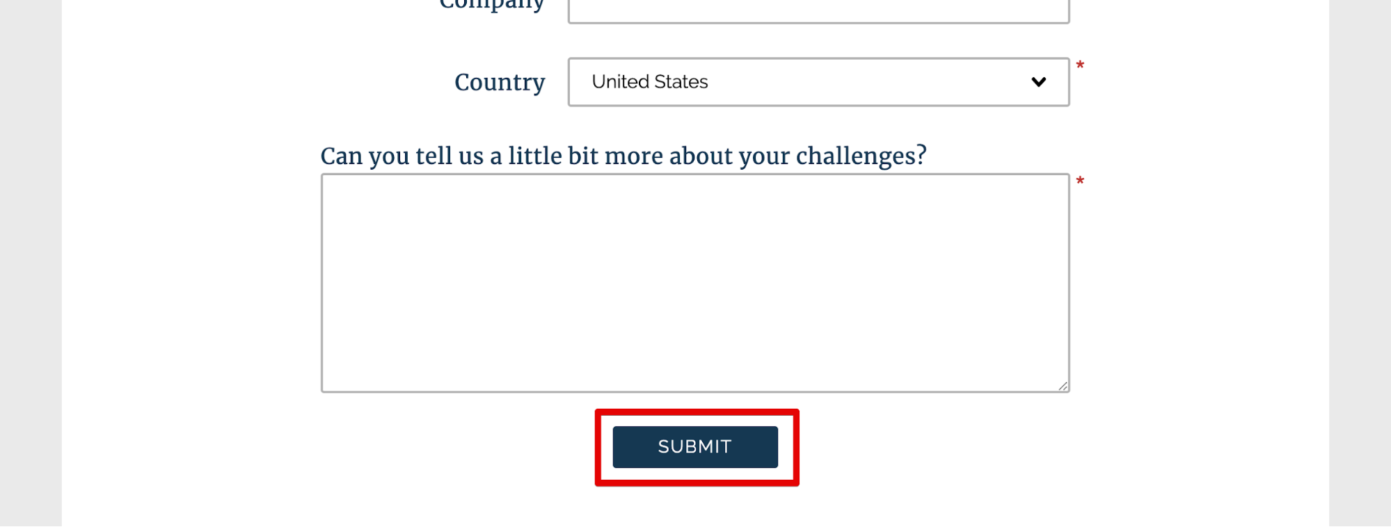
Button
A button is an element on a page that the user can interact with to trigger an event. It’s usually used as a way to confirm an action that the user is taking, like downloading something or submitting a form, and it often stands out from the page, making it a good way to give direction to the user.
A button at the bottom of a form to send a message
CMS
A content management system, or CMS, is a software that lets a user create, edit, and publish content that makes up a website. It typically has a front-end user interface and a deployment system to publish to the site. Some examples include open source CMSs like Drupal and WordPress and proprietary ones like Sitecore.
Component(s)
In most of our conversations, “component” refers to a discrete piece of the front end interface (UI) of a website. Our library of common components is defined in a separate section below.
Content
Text and media elements (images, video, illustration, etc.) that make up components, pages, and websites.
Content in a Card Wide on the Mediacurrent.com Drupal page
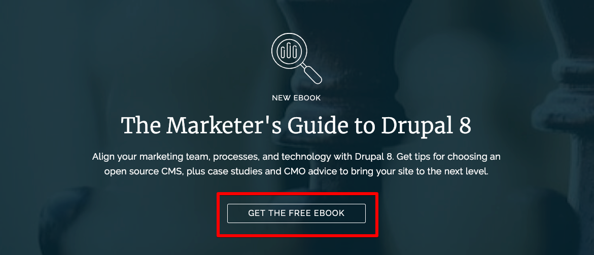
CTA
Short for Call-To-Action, this is often a link or button that is the main desired user action for a particular section or piece of content.
A CTA on a resources page in the form of a button
Eyebrow
A small text label that is often used to categorize content. Typically this is placed above a headline, thus the “eyebrow” metaphor.
An eyebrow on a component that describes the content type
Gallery
A component used to display a collection of media items.

Pictures in a grid that make up a gallery component. In this case, the images open in a lightbox.
Header
The top-most portion of a web page. Often includes a logo and site navigation.

The header on Mediacurrent.com showing the logo, site navigation, and search function
Heading(s)
HTML tags that help give semantic meaning to text elements on a web page. Headings vary from H1 - H6 depending on the importance of text.
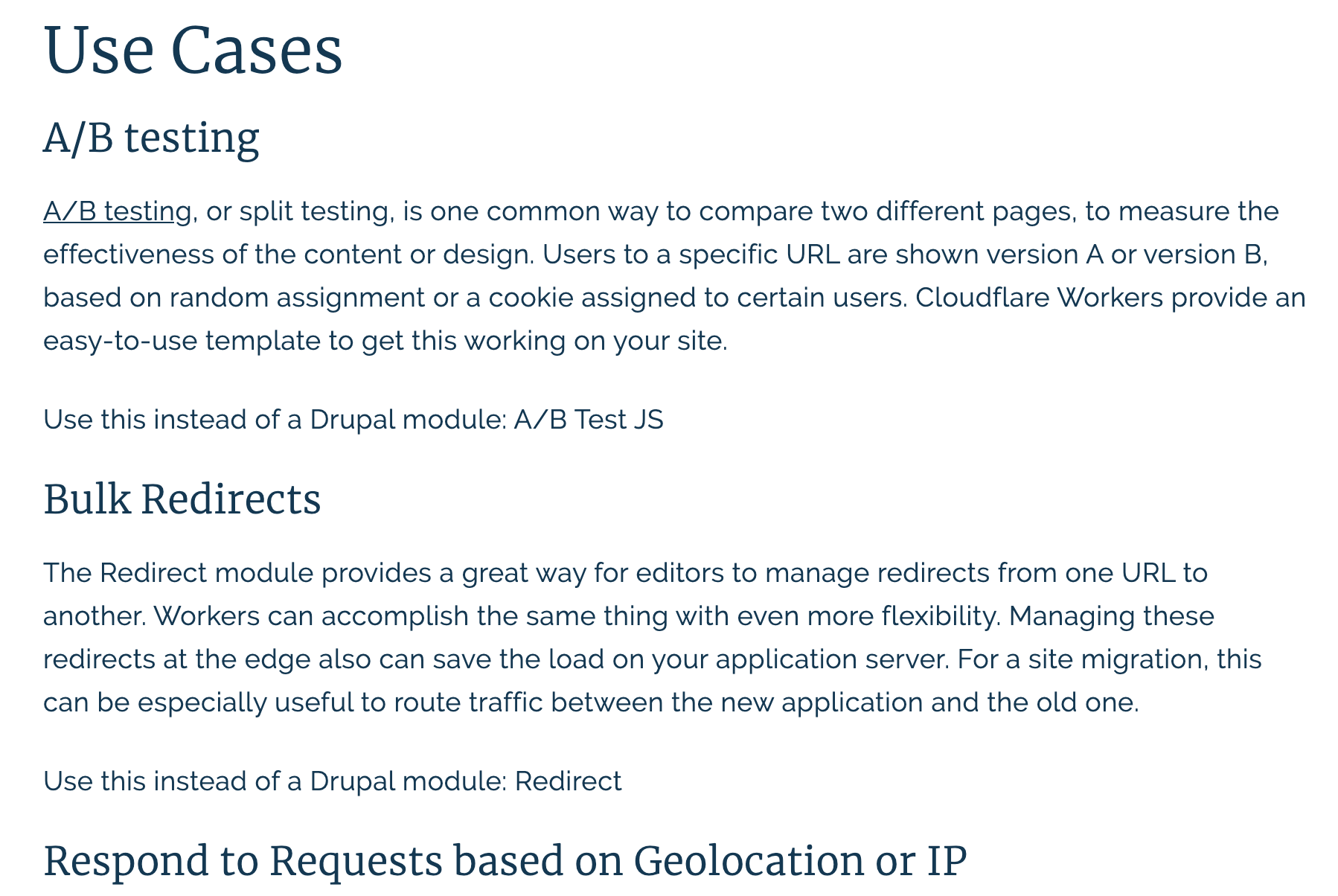
In this image from a blog, there are multiple headings include an H2 (Use Cases) and two H3s (A/B testing and Bulk Redirects)
List
A group of elements and/or components.
A list of resources that includes components and content
Mockup
Part of the design phase, this is the step where wireframes are given personality to align with brand guidelines and user persona research.
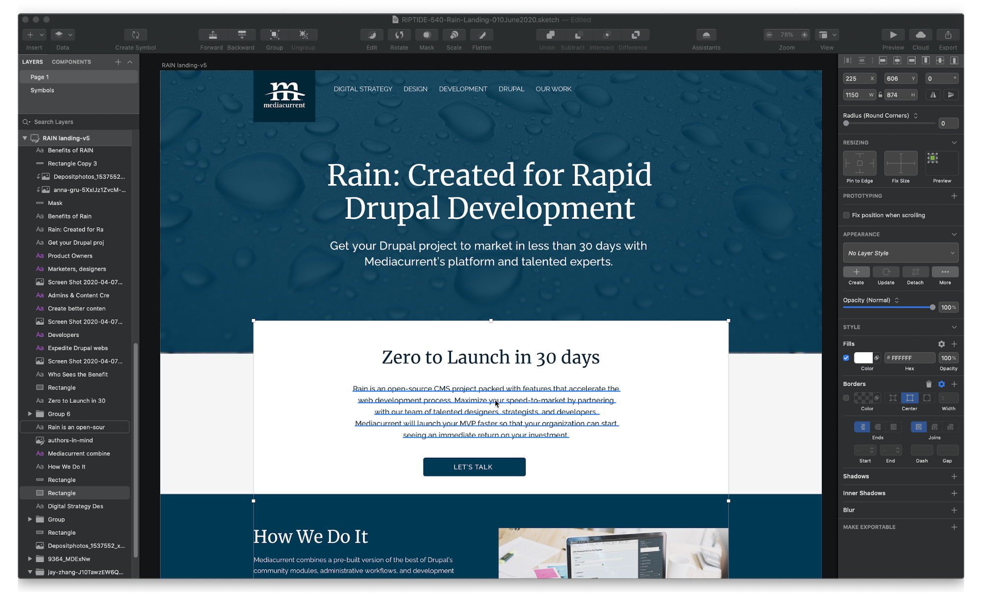
A mockup in Sketch showing layers and design elements
Paragraph
An HTML element that indicates a body of text, intended for displaying text created in a WYSIWYG editor.
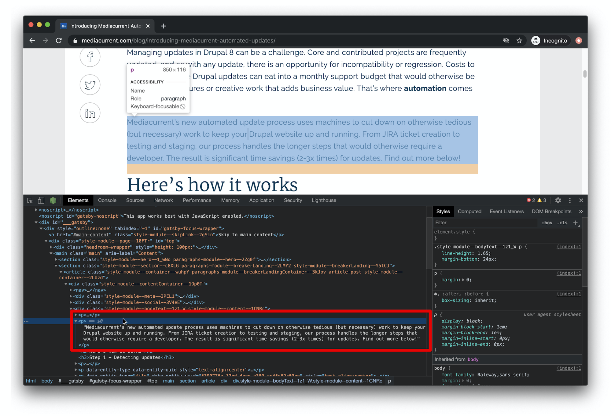
A paragraph element seen in the HTML of a blog page
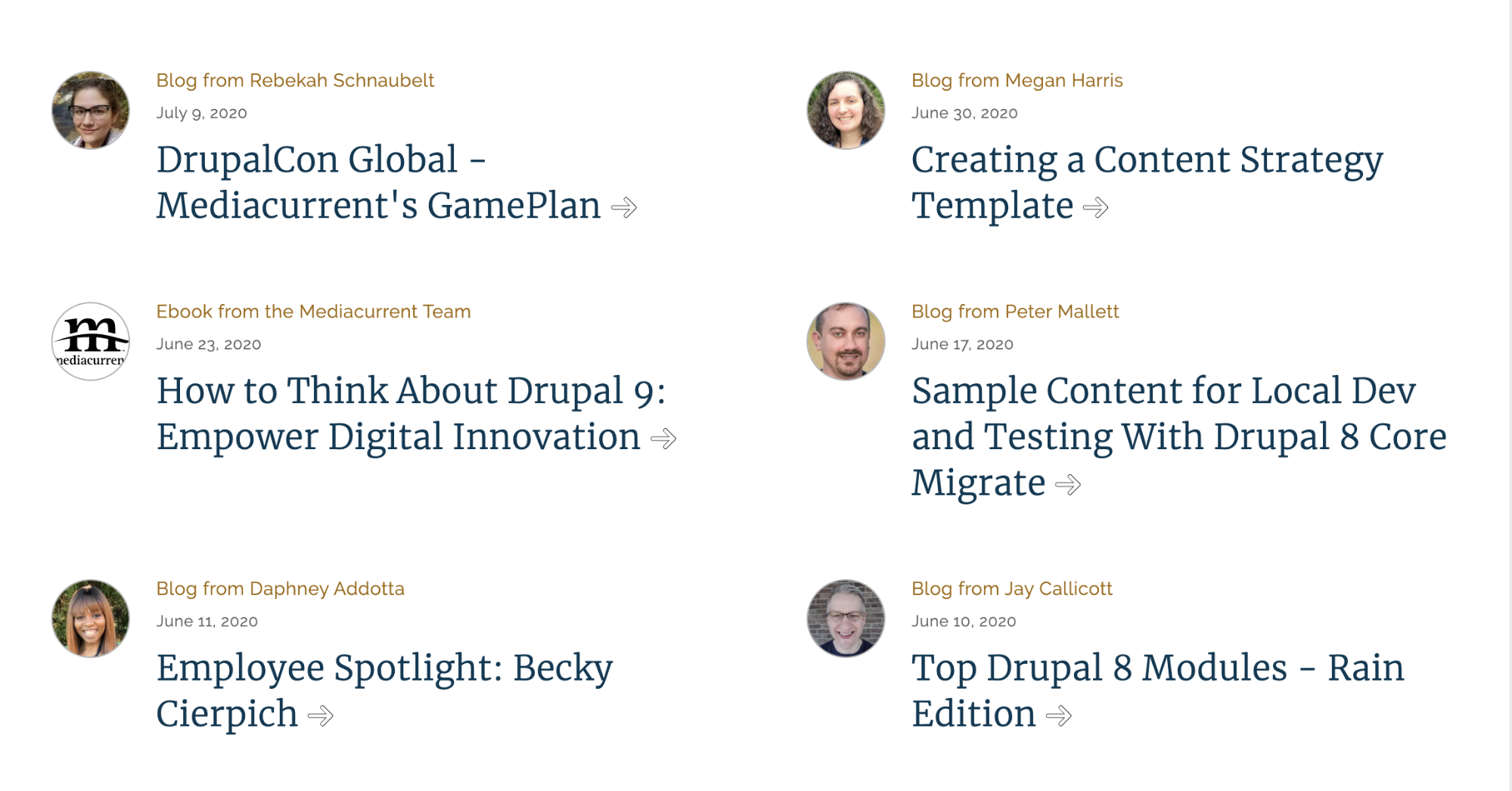
Teaser
Short amount of text used to entice or direct users to explore another section or page of the site.
Teasers driving visitors to learn more about participating and attending events
Viewport
The visible area of a web page on a device – think desktop, tablet, and mobile.
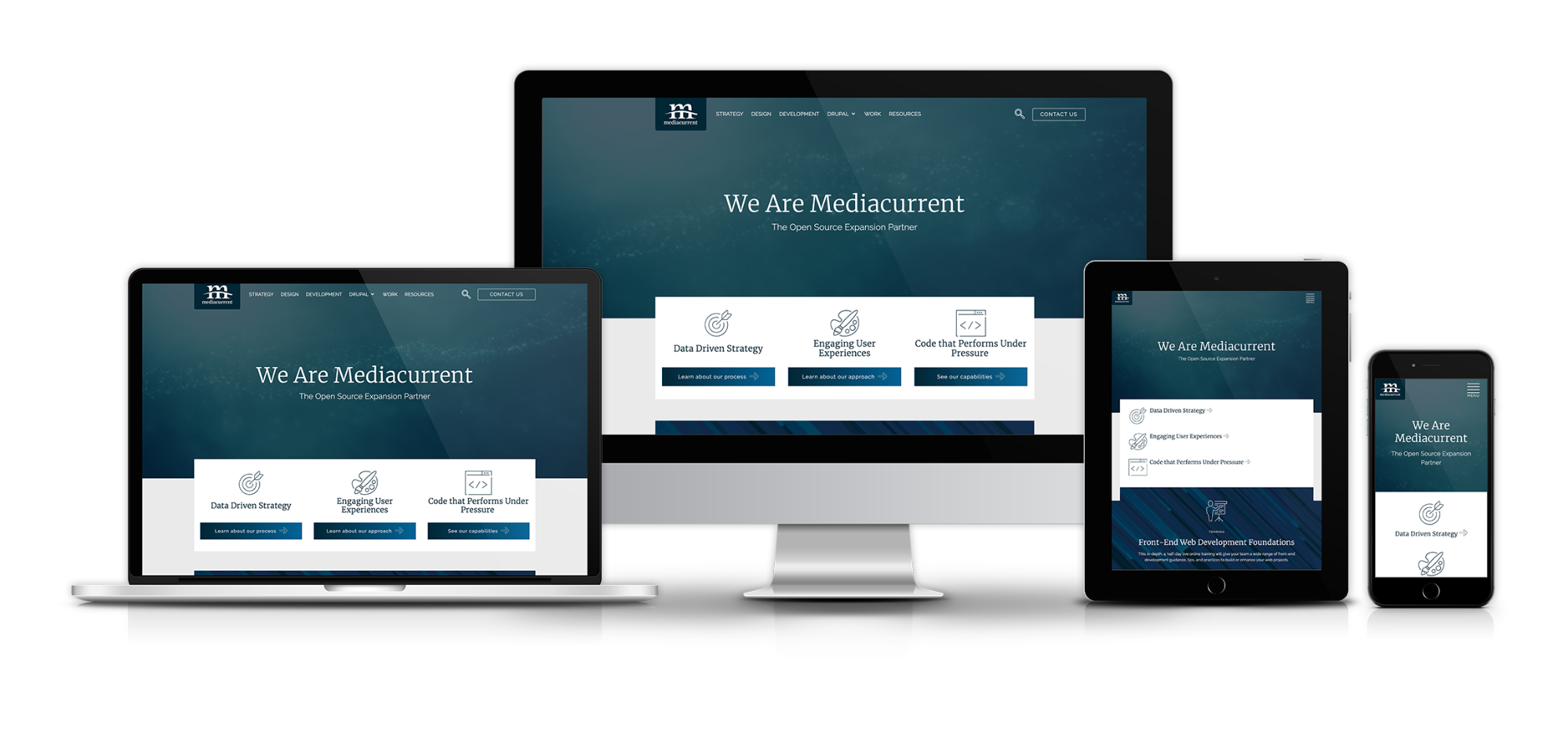
Mediacurrent.com homepage displayed on at a variety of viewport widths
Wireframe
Mostly a planning document, the wireframe is used to map out components and the types of content they contain. Annotations are often added to describe functionality, state changes, or personalization based on user type.
(From left to right) High fidelity and low fidelity wireframes
WYSIWYG
Short for What You See Is What You Get, a WYSIWYG is a common type of field in a Content Management System (CMS) that allows editors to add content to a page with varying degrees of style and element customization. Often editors have the ability to add bold text, italic text, change alignment, add bulleted or numbered lists, insert an image within the text, along with a variety of other controls. HTML source code can often be edited as well.
A WYSIWYG editor on Drupal, where the text formatting can be seen in the editor
Component Library Definitions
The components shown below can all be found in our Rain Component Collection (which are available for download at the end of this blog). They include desktop, tablet, and mobile versions, and when used in your project, can be customized to fit the look and feel of your brand.
Accordion
A heading paired with body text and a hide/show icon. Typically presented in groups as rows, the body text is hidden by default and the section can be expanded by clicking the container that includes the heading and icon. An accordion offers a nice way to declutter an otherwise long page of text and allows users to self select the information they are looking for most.
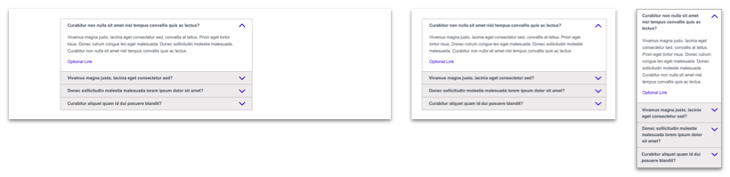
This accordion component is often used for frequently asked questions (FAQs)
Card
Serves as a teaser to a local or external piece of content. An image or video and a title are required. An eyebrow, subhead, summary text, and CTA link are optional elements that can be included at the editor’s discretion. Cards are often, but not always, presented as a list – see Card List below.
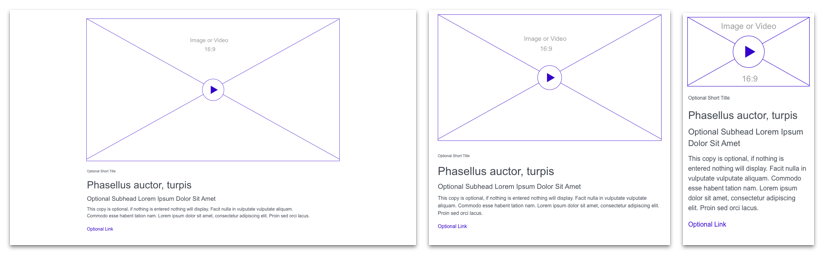
A card component with elements for any situation
Card List
A list of any number of Cards. Size and spacing are dictated by the number of Cards added and the size of the viewport.
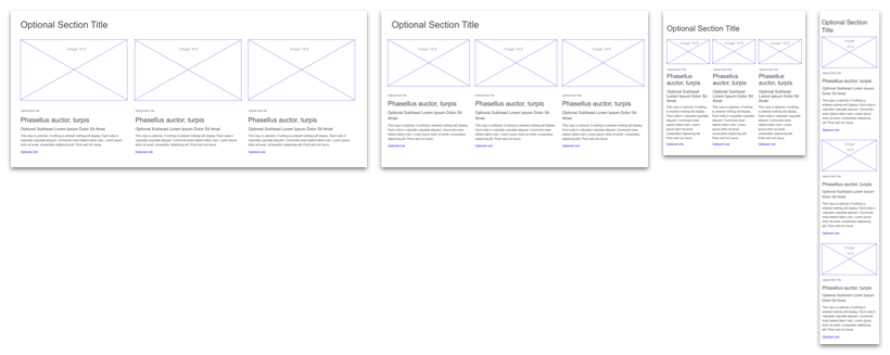
3 card components displayed in a horizontal list
Card List Wide
A summarized list of content, provided by the most recently added by default. Common uses might be a search results page or a staff directory.
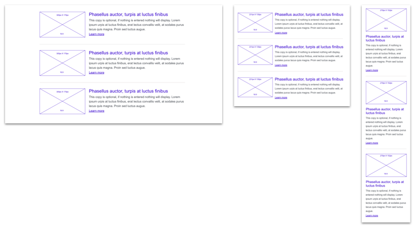
3 wide card components in a vertical list
Card Wide
Identical specs as the Card but presented horizontally at desktop viewports with the media on the left and the text elements on the right. Stacks vertically at mobile viewports. Unlike the Card, this component is used best individually to highlight a single item or piece of content.
A card component with elements stacked to the right
Carousel
Displays a group of Hero components in an interactive carousel using slick.js, which provides a variety of customization options. Also often referred to as a “slider”.

A component that allows users to navigate through multiple Hero components (see Hero below) one at a time
FAQ
Question and answer pairs with an optional link.
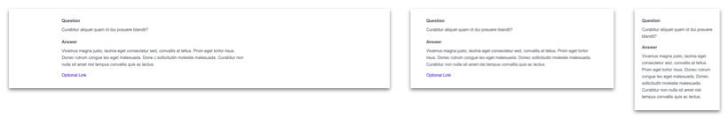
Styled headings and paragraphs in a component display question-and-answer information
Form
A component that presents Infield Top Aligned form fields to the user. Frequently implemented with Drupal’s popular Webform module but also often integrated with 3rd party services like Eloqua, Marketo, Pardot, etc.
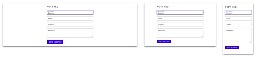
A form component requiring a name, email, subject, and message along with a button to submit
Gallery Carousel
A media gallery that presents a carousel of large images with thumbnails below. Accepts both images and videos of different sizes.
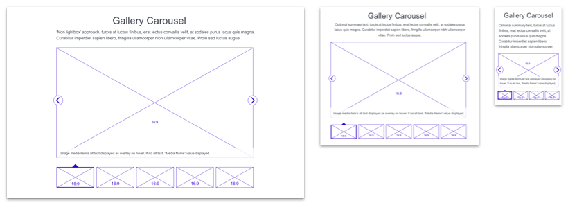
The thumbnail images below the main element can be used to navigate through the items in the gallery
Gallery Lightbox
A media gallery using the Colorbox jquery plugin or similar other plugins, which provides a variety of customization options, accepts both images and videos of different sizes.
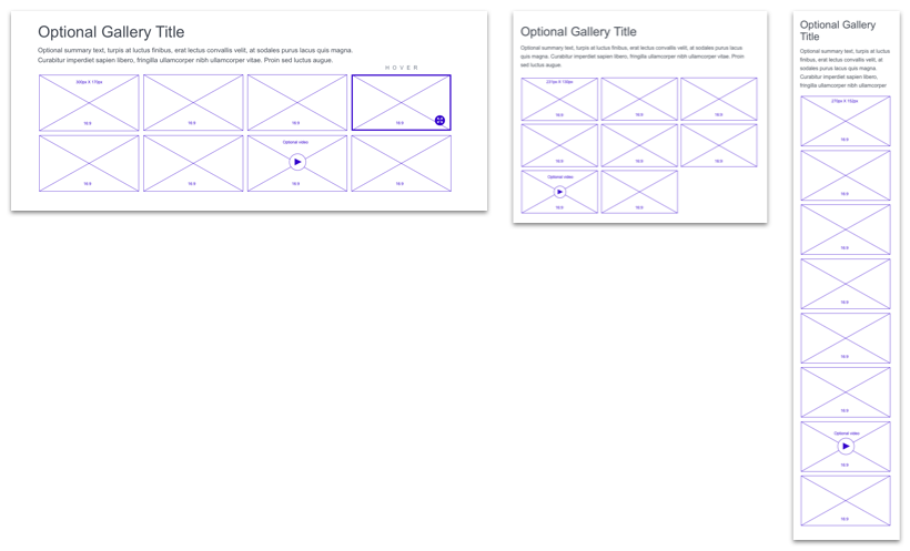
When gallery items, like the ones shown, are clicked, the full item opens in a lightbox
Hero
A teaser composed of a large image with a headline. Often displayed at the top of a page. In some cases a hero may be a collection of items acting as a Carousel (see Carousel above).
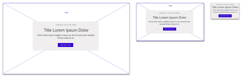
A large visual component with optional text that is most often displayed at the top of a page
Map
A Google Maps embed. Presentation options include either a full width embed or a 50/50 layout with the map embed and address information as text.
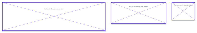
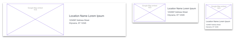
The section of a page that displays a physical location on a map, with or without an address
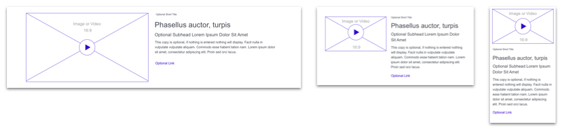
Media
Image or video with optional caption text.
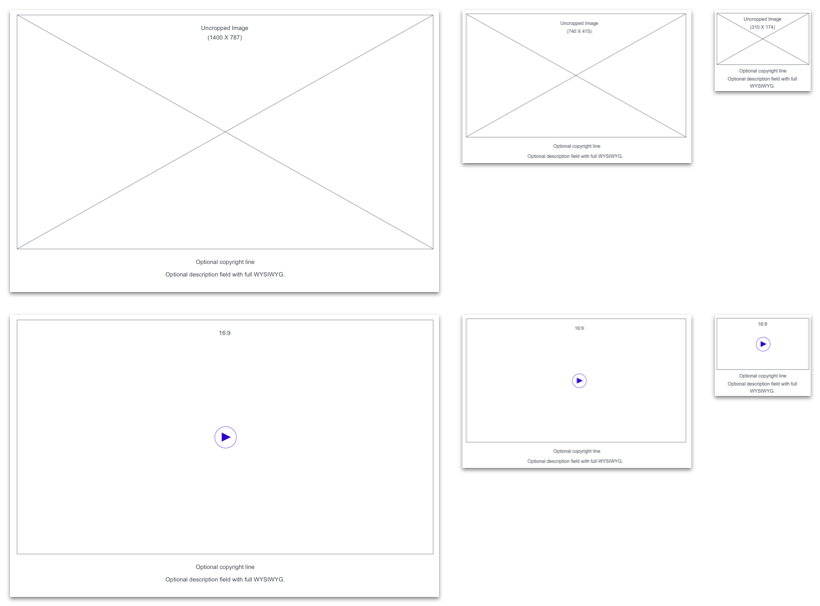
A large component to highlight an image or video with an optional caption to provide more information to users
Quote
A quote with author attribution. Often used to add testimonials to informational product and service pages. Quote text and author name attribution are required. A job title and headshot are optional.
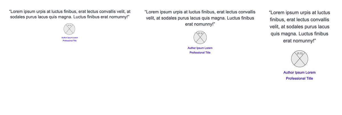
A basic quote component with author attribution and image
Download our Component Collection
Along with this handy glossary, we have also packaged our collection of components as Sketch symbols that you can download today to jumpstart the design phase of your next project. The wireframes correspond with the information architecture that comes out-of-the-box with Rain but can be modified to suit your needs. Get them today by filling out the form below. Now, put on your galoshes and build some websites!