In this 5-part series, take a deep dive into universal design concepts in the context of creating component-based systems for dynamic web content. Get a birds-eye view of the inner workings of user experience (UX) architecture.Brand strategy, user psychology, objective methodology, and data-driven decisions come together, guided by timeless fundamental ideas, to construct today’s digital journeys.
Design Systems

Designing a Set of Standardized Parts
Modular design is responsible for the affordability and safety of the everyday wonders of modern life. From airplanes to coffee makers to robots, the interchangeable parts and assembly lines of the Industrial Revolution have changed our lives dramatically.
Similarly, the transition from pages-first web design to atomic design methodologies (designing and defining the smallest bits first and building up from there) has allowed greater agility and efficiency in the digital space.
At Mediacurrent, we use design systems to solve mundane problems so that developers and designers can focus on solving novel problems. The result is a more scalable, flexible, and easier to maintain platform with plenty of room to build in user value and delight.

The atoms, molecules, organisms, layouts, and pages of atomic design
What is a Design System?
In general, design systems is a systematic approach to creating and maintaining consistent user interfaces which coherently communicate the brand values and empower user experience.
Definitions and Distinctions
At a high level, the design system for our purposes refers first to the methodology we use to approach digital experience design. UX can be very much like planning an event so we take stock of:
We look for similarities and differences so that we can create an organizational structure for “all the things” that allows for:
How Do we Build a Design System?
Content Outlines
Our website organizational structure is a set of components, and we begin by working first in the conceptual space. Designers and content strategists collaborate to outline and prioritize:
Thinking ahead to potential landing pages, dashboards, forms, and more, we begin to ideate components that will serve as the best vehicles for the content and functionality. Laying out all of the content types in a matrix, we get a birds-eye view that allows us to make the necessary decisions around what components to suggest, when to reuse components and when to introduce distinction.
Content outlines provide an illustration of the project plan before it has been refined. This artifact allows everyone on the team (including stakeholders) an opportunity to question content, layout, and functionality decisions before moving on to more detailed work.
There are numerous ways to approach high-level decision-making in a project with similar artifacts. SImple illustrations using a tool such as Mural can be a boon to working through groupings, surfacing important questions, and giving stakeholders something to react to very early in a project, ensuring a more efficient medium and high fidelity design phase.
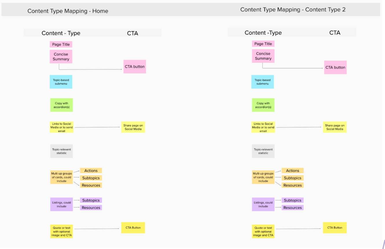
A content-type-to-component mapping structure
Wireframes
Once content outlines have been vetted, the next step is to add detail, such as suggestions for specific fields and character counts by creating wireframes. Although wireframes do not typically suggest styles, they show how components will be laid out at the page level and generally how they will respond across devices.
Expressing Brand Within System
Designs
Once approved, wireframes can be styled according to brand standards. Designers are typically quite free to lay things out however they wish within a component, without regard to the wireframes. Only the general type hierarchy is likely to be retained, as well as all of the selected fields and component layout.
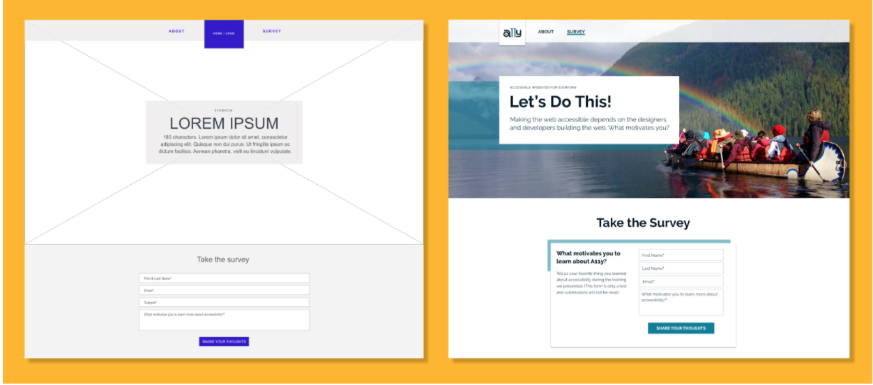
Components in wireframe vs. design states
Style Tiles
In tandem with developing a look and feel for the layouts, the brand is translated into and when necessary, expanded to work in the digital space. Many companies and institutions have brand guidelines that have been assembled with great care, but primarily with print in mind.
As discussed in the 3rd installment of this series, Flexible Typography, detailed considerations are involved when creating optimized type systems for the web. This is one way that existing brand standards are often expanded upon.
Another important consideration is the color system. Color shouldn’t be relied upon as the sole method of communicating things like categorization and clickability, and should adhere to WCAG Accessibility standards in terms of the contrast ratio for color combinations.
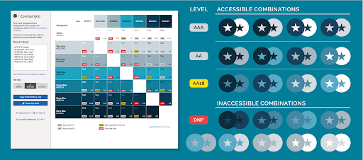
Contrast Grid report showing accessible and inaccessible combinations for a monochromatic brand color palette.
Eight Shapes Contrast Grid is a helpful tool for getting an overview of the accessibility of brand color combinations. Additionally, when data visualizations will be involved (charts, graphs, etc.), it is important to test these colors as groups with a tool like Coblis for contrast against the 8 different types of color blindness, and to follow best practices for building color-blind friendly palettes.
As we move through atomic design methodology we first define the smallest elements or “atoms” - our typography and our color systems. Next, we begin to combine them into “molecules.” This level would include our button system and other interface bits, such as form fields. Designers first map these systems in a Style Tile to assure a consistent, reusable UI down to the finest detail.
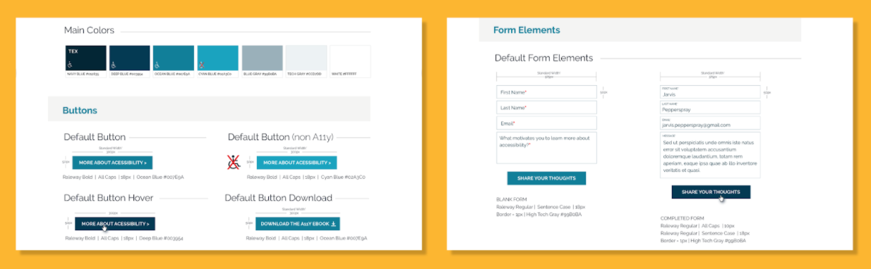
Portion of a Style Tile showing colors, buttons, and form elements
It would be challenging to construct these systems without testing how things will look on-page. This is why visual designs are often developed alongside the style tile. Getting a feel for how elements will look together in key components is a valuable exercise.
Implementing the Design System
Building out a Living Style Guide
With style tiles and the first designs approved, front end development can proceed full steam ahead. Just as the designers have begun by visually defining the smallest elements, developers put those approved definitions to code. First atoms and molecules are defined. Then, organisms are put into place, leveraging the smaller elements (such as type, color, and button styles) to form the organizational containers that are the building blocks of modern websites.
The living style guide is a collection of all of these definitions.Here is an example of a style guide from Emory Goizueta Business School’s Drupal redesign.Mediacurrent’s development process allows us to make adjustments that have a global effect. It enables us to test components for quality and accessibility early on. Front and back end developers are empowered to work simultaneously without stepping on each other’s toes. New designers can come in and quickly grok the system to design additional components as needed, while allowing developers to leverage all of the definitions in the system to efficiently implement new components.
Design systems in action
When the Rubber Hits the Road
A design system is a rigorously organized collection of detailed definitions meant to bring consistency to current and future website content and functionality despite all of the inherent uncertainty. But it is so much more than the sum of its parts!
When a website launches, we’ve designed a modular system that can reach out in the brand’s voice to resonate with its audience on an emotional level. The system makes their decisions easy and their tasks a pleasure. It displays dynamic content and provides a robust site-building toolkit.
What’s Next?
The system is a nimble living thing, able to gather data that we can use to improve it incrementally. With data collected via analytics, user testing, and user feedback we can expand offerings and refine messaging. We can better attune to the audience and provide them with personalized content that makes them feel more at home interacting with our system. We are throwing a party after all - we want all our guests to feel welcome!
In part 5, we’ll discuss image and icon selection end to end. Learn about UX processes that enable us to hone in on a brand’s personality and all of its nuances. We’ll cover how we use digital psychology within visuals for effective communication within the constraints of our components. Read all about it in the next and final installment of this series.