In this 5-part series, take a deep dive into universal design concepts in the context of creating component-based systems for dynamic web content. Get a birds-eye view of the inner workings of user experience (UX) architecture. Brand strategy, user psychology, objective methodology, and data-driven decisions come together, guided by timeless fundamental ideas, to construct today’s digital journeys.
Crafting Language

Choosing your words with care
Every interaction a user has on your organization’s digital channels is a touchpoint with the brand. Every visual, every task, and every word is an opportunity to do more than simply guide a user from point A to point B as quickly as possible.
With the right language, we can simultaneously convey brand personality and engender a sense of belonging. We can efficiently communicate structure, provide a sense of order, and validate users every step of the way to build their confidence.
As the stage is set with the ideal harmony of words, visuals, and motion we can encourage discovery, leading users on a journey of exploration and a deeper connection to the brand. And when it comes to personalizing content, the interplay of the visual and the verbal becomes even more crucial to successfully winning hearts and minds.
Shaping the Journey
Experience design across channels and platforms
A brand is the promise of an experience.
Brand guidelines serve as a way for designers to provide detailed guidelines on how to execute brand elements consistently across channels. This could include experiences in a physical location, conversations between customer service and clients, printed material and other advertising, social media posts, and of course actual products and/or services. Here are some diverse examples of brand style guides from NASA to Uber.

Apple provides a cohesive, stylized experience everywhere their brand appears. Read more about experiential design.
The goal is to not only to communicate the brand’s unique personality but also to connect deeply with users. When providing a sense of what the brand is all about, also give the user a sense of who they can become when they have this brand in their lives. As Steve Jobs said, “Sell the Dream.” Resonating with their current identity and showing how it can be enhanced by a relationship with the brand is the key to building loyalty.
Creating a Brand Lexicon
Guidelines for storytelling: voice & tone
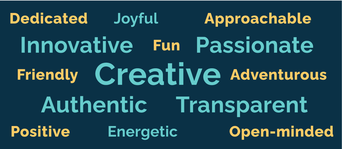
The first step is to be sure to include a language section in your brand documentation. This palette of words goes hand in hand with the visual identity and is used by professionals to communicate the brand’s attributes faithfully across channels.
Here is a solid example of Voice & Tone principles from OpenTable’s brand guidelines. The material provided here is used to inspire copywriters to provide just the right sort of messaging. It shortcuts their research time, eliminating assumptions and guesswork.
In the Discovery Phase of a new project, one of the first activities is to hear the brand story and to get an understanding of the target audience. At this point, it may make sense to clarify and/or expand upon the language details in the brand guidelines as necessary.
Brand language standards can be expressed in a number of different ways, from a simple list of attributes like the above to a detailed content style guide like MailChimp’s.
The Value of Words
Combine wordsmithing with user testing to increase performance
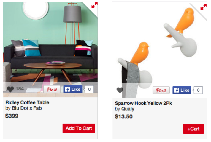
Just a handful of characters can make a substantial difference to the bottom line. For example, in A/B testing, a button labeled “Add To Cart” received 49% more clicks than a button labeled “+Cart” on the website fab.com.
In another example, a Call to Action to buy a product on L’axelle was tested. The wording “Feel fresh without sweat marks” was replaced with a more action-oriented sentence, “Put an end to sweat marks!" and conversions increased by 93%.
At Netflix, my colleagues were constantly testing the non-member homepage — the page whose job is to convert potential customers into customers — every two weeks, forever.
- Gibson Biddle, former VP of Product Management at Netflix
Source: The Three Tools Netflix Used to Build Its World-Class Brand
We highly recommend A/B testing key interaction points where small copy and design adjustments can yield high dividends. User testing, executed judiciously as a part of the project lifecycle can greatly affect the return on investment for your digital campaigns.
Atomic Level Language Design
Detailed content and display specifications
One of the key behind-the-scenes elements of component-based website design is the functional specification documentation that is assembled collaboratively by the project team. As part of this documentation, component requirements include not only expected behavior, but the allowance for flexibility.
Too much flexibility and the design lacks cohesion. Too little flexibility and content editors have a tough time writing copy to fit. Working together with stakeholders, we determine recommended character counts for components, taking the overall language strategy into consideration as we do so.
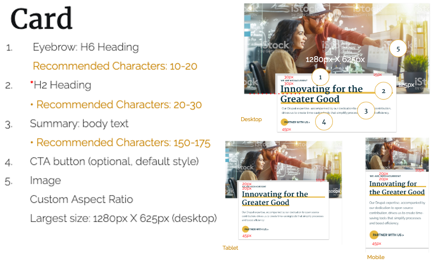
Example of responsive component specifications created for developers to guide implementation.
Accessible Language
Follow accessibility standards to reach a wider audience
While not currently required for Section 508 compliance, the World Wide Web Consortium (W3C) has a number of AAA Level conformance factors around language worth considering. One of these standards is 3.1.5 Reading Level. For the vast majority of website content, clear and plain language targeted to users who have completed 7-9 years of school improves readability for all users.
AAA compliance is viewed as the gold standard, including all the bells and whistles which make the difference between a very good experience and an excellent one.
- Digital Accessibility Centre
When standard 3.1.5 is followed, it enables the production of content that will connect with the largest possible audience. A few tools you can use to quickly test reading levels of content are Webex’s Flesch-Kincaid readability assessor and the online or standalone application Hemmingway App.
Applying Visual and Language Standards
Be consistent and data-driven, but don’t forget whimsy!
As we design websites using component-based systems, one of the biggest challenges we face is to enable more than just bare-bones guidance through information and tasks. Within very clearly defined structures, how do we open up space to allow storytelling, to leave room for delight?

It is not only with images and animation that we establish and strengthen connections with users. Armed with well-thought-out and carefully documented language styles, and backed by strategic user testing, designers can create and continuously improve the connection between a brand and its target audience by providing a reliable, delightful, and personal user experience.
Explore part 1 to learn about visual grammar as a UX strategy. In part 3, take a deep dive into the design principles behind building flexible typographic systems for the myriad of screen sizes out there today. Learn how to improve readability in the name of user comfort and greater accessibility. Get an overview of typographical concerns for multi-language sites.