In this 5-part series, take a deep dive into universal design concepts in the context of creating component-based systems for dynamic web content. Get a birds-eye view of the inner workings of user experience (UX) architecture. Brand strategy, user psychology, objective methodology, and data-driven decisions come together, guided by timeless fundamental ideas, to construct today’s digital journeys.
Flexible Typography

The Art of Setting Type for Dynamic Systems
It is the typographer’s task to divide up, organize, and interpret this matter in such a way that the reader will have a good chance of finding what is of interest to him.
In the 1950s, Swiss typographer and graphic designer Emil Ruder was involved in developing the International Typographic Style. Cleanliness, objectivity, and the use of “the grid” are key features of this approach which still plays a major role in design today.
In 2006, Oliver Reichenstein said,
Web Design is 95% Typography.
And while faster connection speeds have allowed us to provide more media-rich experiences, text-based information is still vital - and the only thing that devices like Google, Alexa, and assistive technologies for the differently-enabled “see.”
Today, the timeless challenge of how to visually present text-based information is as formidable as it’s ever been. Contemporary design decisions take into account the experiences of billions of potential users, located anywhere in the world, in front of screens of all sizes, with a wide range of backgrounds, situations, and abilities.
Fortunately, standards such as those for Heuristic Evaluation, the W3C’s Web Content Accessibility Guidelines and user testing tools such as the System Usability Scale and the Single Ease Question have provided an objective structure to inform the creative works of designers today.
Fast, Scalable, Legible Type Styling
Guiding principles for font selection and implementation
Limit the number of fonts
In the name of consistency, efficiency, and optimized load times, consider combining two harmonious fonts that create a visual hierarchy. Two is considered an ideal number for fonts. Choose a font with enough members in its family to allow design options, however. A font with light and black versions, as seen on some of Google’s best fonts, will provide a versatile UI toolkit.
Most brand standards contain definitions for print and well as web fonts. In the absence of such standards, a review of mission and vision statements can guide you to a font that reflects the brand identity.
Use a responsive type scale
Responsive modular typography scales, when designed and implemented, are an easy way to preserve visual hierarchy across the various screen widths of devices. A modular type scale is a series of type sizes that relate to each other because they increase by the same ratio.
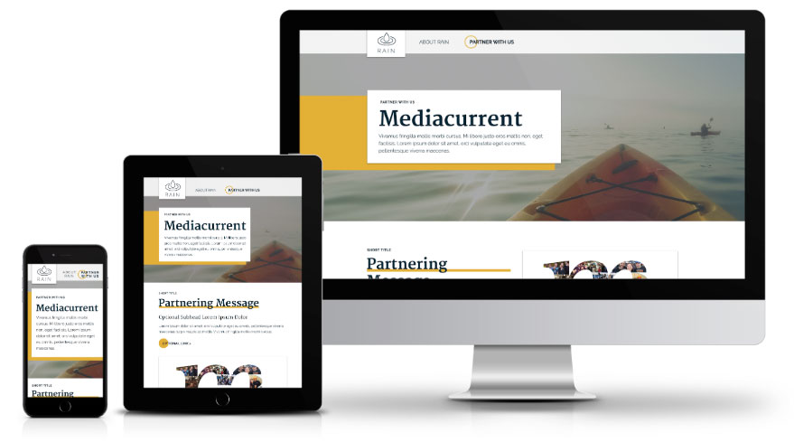
Example of how responsive typography looks across various breakpoints on Mediacurrent’s Rain demo site.
Avoid All Caps for headings and paragraph text
Not only have studies shown text formatted in All Caps decreases reading speed by 10-20%, but this styling presents substantial barriers for users with dyslexia. According to the latest estimates, that is 15-20% of the population.
When headings are less than around 25 characters, all caps is still considered readable for everyone. All caps can also be a valid choice for short navigation titles and concise button copy.
Avoid Italics for headings and paragraph text
A first-time user may spend seconds on your website, not minutes, and as reading speed is dependent on legibility, styling is of paramount importance for all users. In terms of accessibility, italicized letters are nearly illegible to some with reading issues.
Addressing accessibility concerns is a great investment that provides an opportunity to bring in objective best practices to increase usability, readability, and visual impact for all users, opening up your website to a larger audience.
Modern, Readable, Accessible Type Styling
Guiding principles for line and paragraph spacing
Look to the gold standard for accessibility
Because Section 508 compliance is currently attuned to the A and AA Level WCAG 2.0 guidelines, the AAA Guidelines are sometimes left out of the conversation. The guidelines around line and paragraph spacing, however, are especially easy to incorporate. Because they improve the experience for all users, they are well worth considering.

Avoid justified text
People with certain cognitive disabilities have problems reading text that is both left and right justified. The uneven spacing between words in fully justified text can cause "rivers of white" space to run down the page making reading difficult and in some cases impossible. Text justification can also cause words to be spaced closely together so that it is difficult for them to locate word boundaries.
Implement a maximum width for containers of heading and paragraph text
For people with some reading or vision disabilities, long lines of text can become a significant barrier. They have trouble keeping their place and following the flow of text. Having a narrow block of text makes it easier for them to continue on to the next line in a block. Text blocks must be no wider than 80 characters.
When determining how to limit the width of a responsive text block, it can be helpful to use a character counting tool. Or try advanced math! The Golden Ratio Typography Calculator generates suggestions for your entire type hierarchy based on the Golden Ratio: a pattern found in nature that is inherently pleasing to the human eye.
Provide ample line spacing for paragraph text
People with some cognitive disabilities find it difficult to track text where the lines are close together. Providing extra space between lines and paragraphs allows them to better track the next line and to recognize when they have reached the end of a paragraph. Provide line spacing that is at least 1.5 (a space and a half) in text blocks and spaces between paragraphs are at least 1.5x line spacing.
In the first post of this series, we discussed the advantages of generously-sized type comfortably line-spaced within a width-restricted column. Not only does this approach align with that of today’s best-in-class websites and provide a comfortable, welcoming reading experience, it is universal design that is accessible and all-inclusive.
Preparing to Reach a Global Audience
Scratching the surface of localization
Designing type for Right To Left (RTL) languages
Arabic is the 4th most popular language globally and 60% of Arabic speakers prefer browsing internet content in Arabic. Aligning text to the right side is key, and so is upsizing the font to preserve text readability. Factoring in the shorter length of words as most Arabic words. Read more about web design for RTL languages.
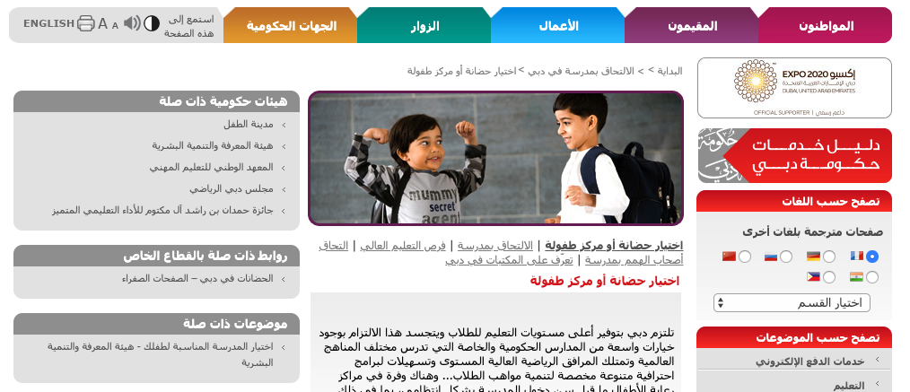
Example of RTL language typography on dubai.ae.
Accommodating translated text
Character counts expand or contract according to language. Expect a 15 - 30% expansion when translating English to Spanish or Portuguese, for example. When planning to translate English to Chinese or Japanese, however, expect variation. Read more about typography for translated text here.
Planning for character-based languages
Written Japanese, for example, consists of thousands of characters across four character sets: hiragana, katakana, kanji and the Latin alphabet. Japanese users perceive carelessly designed websites as reflective of brand quality. They describe products as “unnatural”, “foreign”, and “suspicious.” The work to get from unnatural to perfect is not hard. Read more about standards for presenting Japanese text on the screen.
Applying and Iterating Type Systems
Continuous improvement based on user feedback
After carefully selecting type styles representative of the brand experience, applying them with accessibility in mind, defining parameters within responsive components, and perhaps including specifications for translated type, what comes next?
We take these specs and build a living style guide to catalog the site’s elements and components. Having the building blocks all in one place not only ensures consistency but allows developers to rapidly adjust or efficiently leverage the existing pieces to create more complex components.
A living style guide makes it easier to add new patterns to meet your needs and the needs of your users that arise as “the rubber hits the road” when content editors begin using the site and feedback is collected from users, ideally through methodical tests.
Technology has evolved rapidly since pioneers like Emil Ruder developed the Swiss style, and is always offering new challenges for designers. But happily, this evolution has allowed us to collect data to objectively guide our practice and to create, share, and continuously improve standards for accessibility and usability, allowing us to meet the challenge of designing with confidence for the global audience. What a great time to be a designer!
In the next installment, we’ll cover pattern libraries/ living style guides in greater detail. We’ll discuss how design systems ensure a consistent experience and make ongoing enhancements much easier. Learn about the steps it takes to build an emotion-rich, brand-true user journey within the restricted structure of a website built to last for years displaying dynamic, user-entered content.