We finally made it to the last part of this series where we get to put all the pieces together and integrate our Card component with Drupal. If you have been following along, I hope you see the value of this theming approach.
Let’s continue where we left off. In part 1 of this series we build the Card component in our KSS Node Style Guide, and in Part 2 we built the back-end functionality for the Card component in Drupal. Now we are going to connect the front and back-end to complete the component integration. Keep in mind that there are several ways to accomplishing what we’re about to do so feel free to change things if you find another approach that works better for you.
Here are the final steps we’ll follow on this series:
-
Components Libraries Module
-
Custom Paragraphs Twig Template
-
Create Card library
-
Include Card Component into Paragraphs Template
Component Libraries Module
In order to integrate our card component or any other component for that matter, we are going to install the Component Libraries module which registers components libraries defined by our theme as twig namespaces. We will be using our theme’s namespace in order to include our components’ twig template into Drupal’s custom twig template suggestions. The Component libraries module allows Drupal to be aware of our component’s twig files. Without this Drupal doesn’t know those files exist. Go ahead and download and install the Component Libraries module.
Paragraphs Custom Twig Template Suggestion
In order to have full control of the markup in our component, we need to create a custom twig template suggestion. But we first need to determine which templates are being used by Drupal to render our card component.
Since we turned on twig debugging in part 2, we can inspect the Card node and identify the templates currently being used to render it.
-
In Chrome, right-click anywhere on your Card node and select Inspect Element
-
You should see a screen similar to the one below:
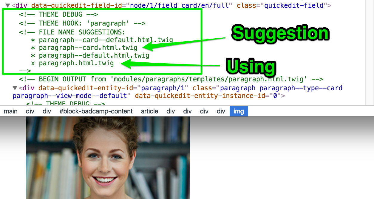
Notice that twig debugging allows us to see all the different templates Drupal is using to output the content on the page. We are interested in seeing what template is being used to print the card content. From the screenshot above we see that template paragraph.html.twig (template with X next to it) is being used. We want to be able to customize this template however we don’t want to override the original paragraph template as this is used by any paragraph entities in the entire site. What we want to do instead is create a copy of the paragraph template and customize it to our needs.
Copying Paragraphs.html.twig
-
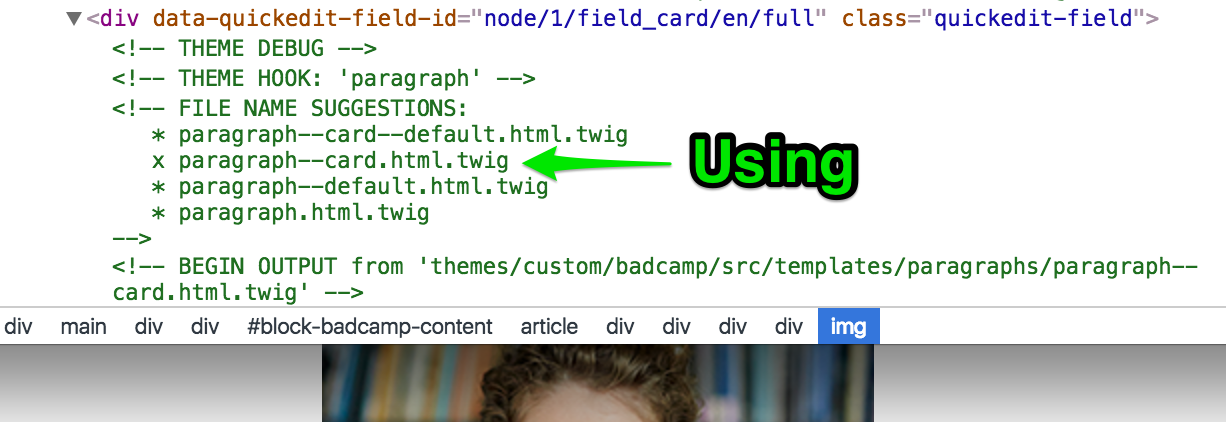
Navigate to /modules/Paragraphs/templates/ and copy paragraph.html.twig to /themes/<your-theme>/templates/. If you plan on creating multiple templates in your theme you can create sub-folders inside /theme-name/templates to better organize them (i.e. /templates/paragraphs/paragraph.html.twig).
-
Rename the paragraph template in your theme to paragraph--card.html.twig. The name was obtained from the Drupal’s suggestions shown in the screenshot above. Learn more about drupal template suggestions.
-
Clear your site’s cache for Drupal to recognize the new paragraph template.
If we inspect our code again, we should see our newly created twig template being used to render our component
Creating a Theme’s Namespace
As previously mentioned, Drupal does not know about the twig templates in our components folder. This is where the Component Libraries module comes in. We need to create a namespace that points to our component’s twig templates so that Drupal can make use of them. In your theme.info.yml file we need to create a namespace as follows:
component-libraries:
  demo:
    paths:
      - src/components
The above defines our Namespace (demo). The Namespace can be named anything we want, for the purpose of this exercise we are using demo. The path to our components in this example is src/components.
Create Card Library
One of the great features of D8 is the ability to create libraries which can be used to add CSS or JavaScript to our theme. Learn more about Drupal 8 Libraries.
Open <theme-name>.libraries.yml and create a library for the Card component as shown here:
card:
  css:
    component:
      dist/css/card.css: {}
  js:
    dist/js/card.bundle.js: {}
  dependencies:
    - core/jquery
Based on your needs, you can make use of as much as the paragraph--card.html.twig template offers. For this example, we are going to completely override the template.
So let’s start from the top. First, we will leave all template variables info shown as comments from line 1 through about line 38. These comments can be useful if you are planning on making additional template changes.
Attach the Card Library
We will progressively update the paragraph template and will explain each part of the process. In your paragraph--card.html.twig template (around line 40 if you kept all the template’s original comments), attach the card library so we have access to all CSS and Javascript authored in part 1 of this series.
{{ attach_library('demo/card') }}For every component, I like to build a library where I declare the CSS and JS for that particular component.
Include the Card Component into paragraph--card.html.twig
Let’s now include the component we built in part 1 into this Paragraph template.
{% include '@demo/card/card.twig' %}Notice the @demo part on the path above? This is the namespace we created in previous steps using the Component Libraries module. The @include twig statement allows us to nest twig files into other twig files. In our example we want to nest the card.twig file we built in part 1 into the custom paragraph--card.html.twig.
So we included the card component but we still need to tell Drupal which fields we want to output so that our component is rendered by Drupal with data from Drupal and not stock content from .JSON.
If we look at the component’s .json file (components/card/card.json), we see the variables needed to make up the component. Here’s an example of those variables from card.json: image, name, bio, socialLinks.
In the json file we have stock content to render the component in the style guide. However, in Drupal we want to use the drupal content we added when we created the card node in part 2 of this series. Let’s tweak our @include so that we use Drupal’s content.
{%
  include '@demo/card/card.twig' with {
    image: content.field_card_photo,
  } only
%}
You can add additional variables by passing them after the with keyword. Above we are passing the image variable but this time, we are using Drupal’s field_card_photo field which we added when we created the card paragraph type. Let’s add the remaining variables and corresponding drupal fields:
{# set a variable for social media icons
to later pass to the component template #}
{%
  set social = [
    {
      url: content.field_card_social_link.0['#url'].uri,
      icon: content.field_card_social_link.0['#title'],
    },
    {
      url: content.field_card_social_link.1['#url'].uri,
      icon: content.field_card_social_link.1['#title'],
    },
    {
      url: content.field_card_social_link.2['#url'].uri,
      icon: content.field_card_social_link.2['#title'],
    },
  ]
%}


{# include card component template #}
{%
  include '@demo/card/card.twig' with {
    image: content.field_card_photo,
    name: content.field_card_name,
    bio: content.field_card_biography,
    socialLinks: social,
  } only
%}
Using ‘only’ restrict the node context so we can only include the variables we need.
If you are wondering where the field names came from, we created those in Part 2. You can also find them if you Kint the card node by typing the following somewhere in the paragraph--card-html.twig template: {{ kint() }}. Kint allows us to view all the variables available to us when the Card node is rendered. We are able to use Kint because we enabled the devel and kint modules in the previous part of this series. Learn more about debugging with kint.
You may be wondering, how did you end up with social as the value for socialLinks. I actually cheated a little. We need to do one more thing for social to work. We are going to create a new variable from a render array that will include each of the values of our social links. Although this is not necessary, it will make our @include statement cleaner and easier to read. Here’s the revised version of our paragraph--card.html.twig template:
{# set a variable for social media icons
to later pass to the component template #}
{%
  set social = [
    {
      url: content.field_card_social_link.0['#url'].uri,
      icon: content.field_card_social_link.0['#title'],
    },
    {
      url: content.field_card_social_link.1['#url'].uri,
      icon: content.field_card_social_link.1['#title'],
    },
    {
      url: content.field_card_social_link.2['#url'].uri,
      icon: content.field_card_social_link.2['#title'],
    },
  ]
%}


{# include card component template #}
{%
  include '@demo/card/card.twig' with {
    image: content.field_card_photo,
    name: content.field_card_name,
    bio: content.field_card_biography,
    socialLinks: social,
  } only
%}
Whew! I hope I did not lose you and if you are still following along, congratulations! You just completed the component integration series. If you refresh your card node page you should see the Card component styled properly. In addition, you should be able to expand/collapse the biography by clicking the designated button.
Summary
Let’s quickly review what we just did to get a twig component integrated with Drupal. The main goal of this approach is to build the component once, and have Drupal make use of it without having to redo the work all over again which is what traditionally has been done. This is good for many reasons: First, it gives us a headstart to front-end development even if back-end is not complete or has even been started. Second, it ensures our style guide is the single source of front-end development, and third, you end up with cleaner and easier to maintain code.
-
We started by building the pieces of the Card component in KSS Node where we identified the markup and styles needed to make it look great.
-
We then moved to Drupal where after configuring our development environment we proceeded to creating the Card Paragraph entity and making it part of the Basic Page content type by adding it as an entity reference field.
-
Finally, we added the missing pieces to Drupal (Component Libraries module), creating a namespace and including the Card component into a custom paragraph twig template for Drupal to render the component.