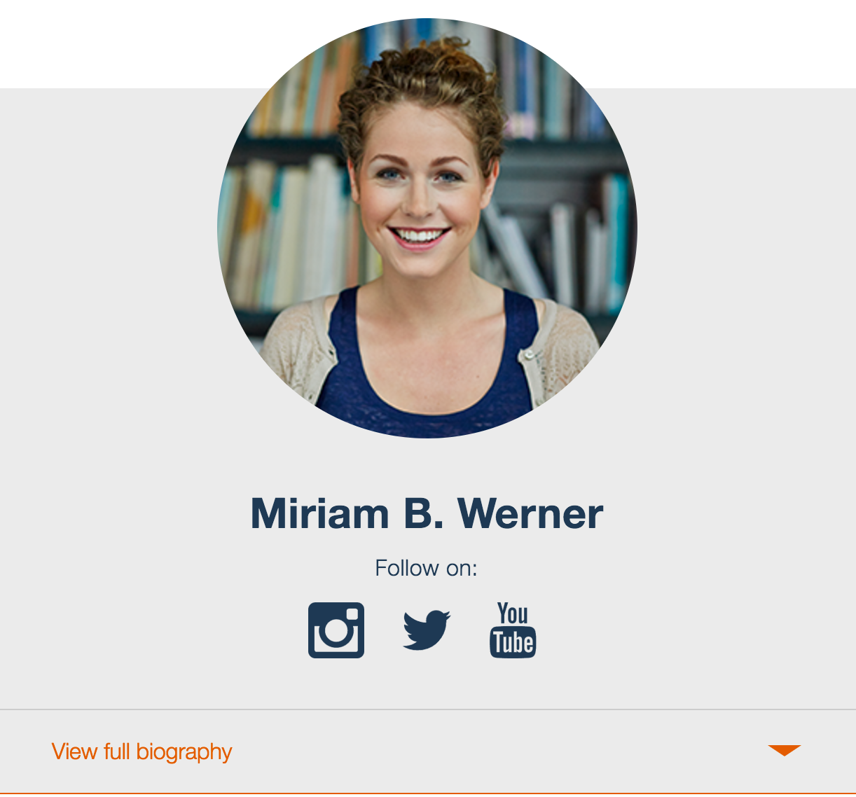
Welcome to Part 2 of my Integrating Components with Drupal Series. If you are following along, in our first part of this series we built the following style guide component.

In this second part, we are going to take the necessary steps to prep Drupal to build the back-end functionality of our Card component. However, before we do that, we need to get a few things in place, such as:
-
Configuring Twig Caching and Debugging
-
Paragraphs Module
-
Component Libraries Module
Twig Cache and Debugging
Disabling Twig caches and enabling debugging are very useful when working on a Drupal theme. Disabling cache reduces the need to clear cache when new changes are introduced and debugging allows us to see templates being used to render content. Keep in mind that these configuration changes are only intended for development. You should never do this on a production site.
If this is a new D8 installation, disable CSS and JavaScript aggregation which are turned on by default. Do this by going to Configuration | Performance and make sure all boxes on the page are unchecked. Then click Save Configuration. You can also permanently turn off aggregation in your project by add these two lines to the end of your settings.php
$conf['preprocess_css'] = FALSE;
$conf['preprocess_js'] = FALSE;-
The next thing we need to do is to disable D8 caching and enable Twig debugging. This will become handy later in this tutorial. Follow these steps to disable cache in D8.
-
Finally, let’s install and enable Devel & Kint (both part of Devel module). This will allow us to debug Drupal and identify which templates are being used when content is rendered as well as what variables are available to us. More on this later.
Paragraphs Module
Next we need to Install and enable the Paragraphs module which will allow us to create a custom entity for the Card fields such as name, bio, social links and photo. Creating a custom entity can be accomplished in many ways such as a custom content type or a custom block however, Paragraphs offer more flexibility because you can add them as fields inside a content type which is what we are going to do.
Create a Paragraphs Type
As I mentioned before, we can build the Card component in Drupal in different ways, for this tutorial we will use a paragraph type.
-
Click Structure | Paragraph Types.
-
Click Add Paragraphs type.
-
For label type Card
-
Click Save and Manage Fields
-
Let’s create our fields, accepting all default settings and using the following specs:
|
Label |
Field name |
Field type |
|
Name |
field_card_name |
Text(plain) |
|
Bio |
field_card_bio |
Text(plain, long) |
|
Photo |
field_card_photo |
Image |
|
Social Links |
field_card_social_links
|
Link |
6. Go to Manage Displayand hide the labels on all the fields.
Adding the Paragraphs Type as a Field to a Content Type
If you already have a custom content type you would like to use for this exercise, you can use it next. Otherwise you can pick any of the content types that come with Drupal. I will use the Basic Page content type.
-
Click Structure | Content Types.
-
Click Manage Fields next to the content type you will be using (Basic Page for me).
-
Delete the Body field from the content type unless you are using it for other purposes.
-
Click Add Field.
-
Select Paragraph as the field type.
-
Type Card as the field label.
-
Click Save and Continue.
-
For Allowed number of values select Limited 1. Sometimes you may want to add multiple instances of items in your content type, in this case we only want to display one single card component.
-
Click Save field settings.
-
Modify any settings as you see fit. The only requirement on the next screen is to select a Reference Type.
-
Select Card as the Reference type.
-
Click Save settings.
Our content type is now ready to generate nodes using the card component. Let’s do that next.
Create New Card Node
-
Click Content | Add Content.
-
Select the content type where the paragraph entity field was added (Basic Page for me).
-
Click Add Card if paragraph entity is not open by default.
-
Fill out all the fields. For the social media fields, be sure to provide the URL for the social channel as well as a Link text (i.e. Facebook, Twitter, etc.).
-
Click Save and Publish. Your new Card Node should look something like this:

As you see, things don’t look quite like we expected. None of our styles are being applied and the card component in drupal looks nothing like our style guide.
At the moment, the style guide Card component is not available to Drupal. One reason is that Drupal by default looks for Twig template inside the theme’s /templates folder. Our components actually live inside /src/components. In the next and last part of this series we will complete the setup by configuring the Component Libraries module which enables the communication between Drupal and our style guide components by creating a theme’s namespace.