Welcome back! In part 1 of this series, we covered the early stages of our design process including how we define challenges and immerse ourselves in a brand during Strategic Design Discovery, create Style Tiles to explore various aesthetic directions, and map user personas to conversion paths with wireframes.
In this post, we’ll complete the picture by detailing how we finalized the award-winning Drupal design of Guardian’s brand new direct-to-consumer site. We’ll discuss the contrasting visual concepts that were presented, the fleshing out of the final concept with custom illustrations and iconography, and the component-driven approach we take when building out a site.
Mockups and Visual Design
Next, it was time to synthesize the visual tone established in our final Style Tile with the user experience laid out in our wireframes to bring this product to life! Some important goals we focused on during this part of the process were to:
- distinguish Guardian among the competition
- ensure that the experience was accessible and inclusive
- delight users
While we took an overall component-driven approach (more about that below) it was important to explore the voice and tone of critical pages along the user journey to ensure we were communicating the key messages of this new line of business for Guardian.
To generate an overarching concept and gain buy-in from all stakeholders, our starting point was the homepage. As mentioned above, Guardian had settled on the key message of Life is full of surprises. Paying for them shouldn’t be. In conceptualizing this we used the “hero” section of the homepage to explore exciting interaction options that would be unique and fun, anchor the concept, and also add context by providing helpful product information. Illustrating the element of ‘surprise’, we explored a variety of possible directions and landed on two initial concepts titled “Casual Friday” and “Buttoned Up”. Both concepts incorporated the visual style elements established on the approved Style Tile, New Blue Suit.
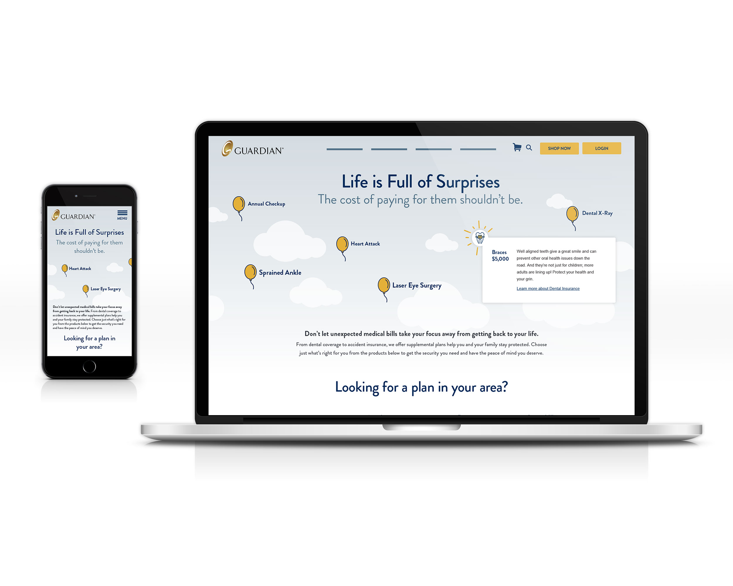
1. Casual Friday
A “whimsical and free” approach, this option relied heavily on illustrated elements and generous amounts of white space. The hero features an interactive, animated scene of balloons floating among the clouds. Balloons are not only joyful elements of surprise celebrations, they also surprise people when they burst. With the balloons and clouds animated to scroll left-to-right, users could interact with the scene by hovering over (or tapping on mobile) any balloon at which point the balloon would pop to reveal a modal that displays the “surprise” cost of common, unpredictable life occurrences that Guardian can help you manage. The story continues as the user scrolls down the page until they arrive at the ‘Why Guardian’ section which completes the scene with an illustrated bottom border of houses, people, and a few subtly animated balloons.
Before (page load) and after detail of interactive spinner within the hero component.
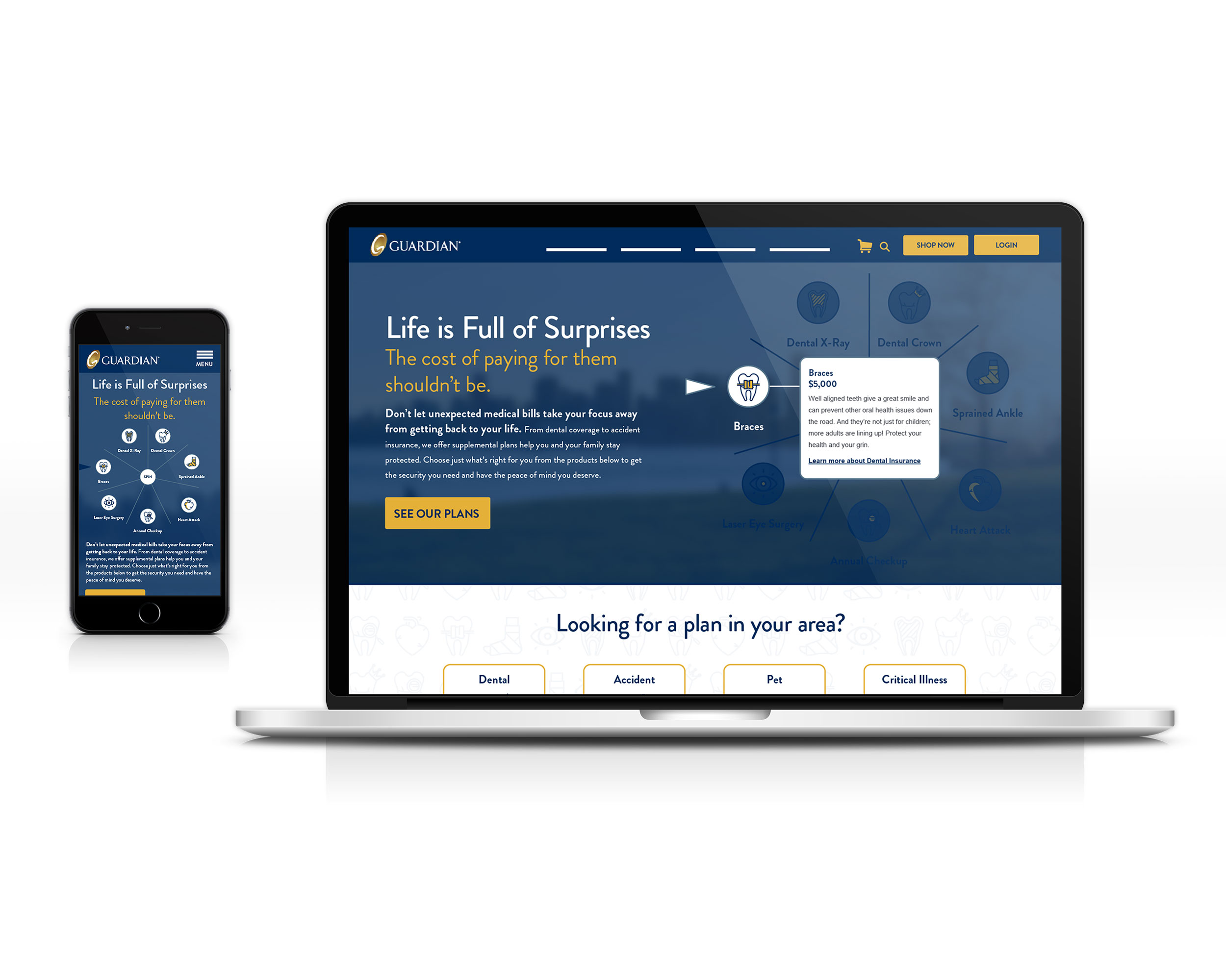
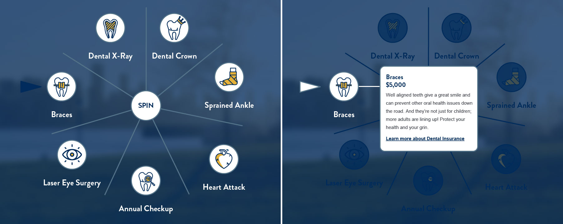
2. Buttoned Up
A more “corporate and predictable” feel this option provides a contrasting visual appearance. Clearly defined sections limit the amount of whitespace and divide the different components on the page. Photography is used more prominently to closer align with what is common in the industry, and illustration is used less prominently – mostly limited to icons and textural background wallpaper patterns made from the icons. The hero section features an interactive “Wheel of Surprises” spinner inspired by traditional board games. On page load several icons representing those common, unpredictable life occurrences are visible and in the center the ‘SPIN’ button animates to indicate interaction. When pressed, the wheel spins and stops on a random surprise, the details of that surprise are revealed, and the other icons fade to give more prominence to the information. The section below uses buttons styled as game piece tiles to direct users to the different products offered.
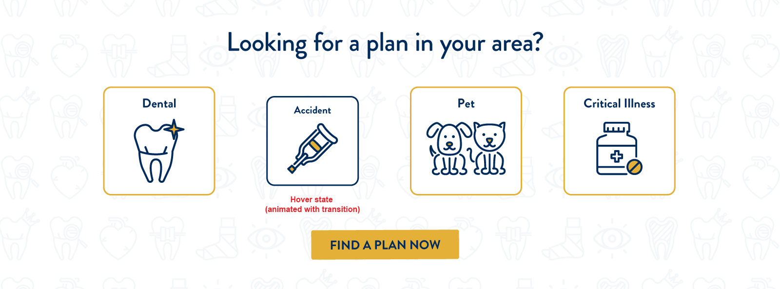
Find A Plan component detail showing buttons styled as game piece tiles with hover state annotation.
Our team could have almost predicted that the Buttoned Up option would be selected as the path forward and the concept to refine as it is generally the “safer”, less risky direction. Instead, Guardian surprised our expectations by enthusiastically deciding to reach outside of their comfort zone and move forward with Casual Friday.
Then, through a series of iterations we landed on an approved concept that traded the balloons for rain clouds to communicate Guardian is the shining sun on a cloudy, rainy day full of undesirable, unpredictable events. We named the final design direction “Casual Friday – When It Rains It Pours”. As the page loads, a night sky turns to day, the sun rises, and the rain clouds appear then begin moving across the screen – interactive on hover or tap. Scrolling from top to bottom of the page, the rain has cleared when the user enters the “Why Guardian” section where they view a diverse group of people outside celebrating the beautiful day. To ensure that our final direction was accessible to all users, our Accessibility Lead provided a thorough review, and areas that did not meet WCAG 2.0 guidelines were addressed.
After this visual direction and concept was approved, we started creating illustration and icon assets along with mockups of key sections, tools, components and pages of the site – including product landing pages, a quoting tool, a provider search tool, and the single and multi-product enrollment/checkout process.
Custom Illustration
During the early phases of the project hints of illustration were constructed quickly in order to convey our ideas and communicate to Guardian a sense of vision that could be applied throughout the website. Once our final concept was approved by all stakeholders, we started to create various illustrated scenes to help tell the story and be used as background images for different components being developed. The responsiveness of these assets were considered during their creation and some of these scenes were also animated!
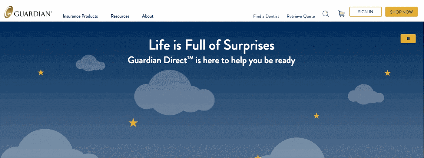
Homepage hero component illustration.
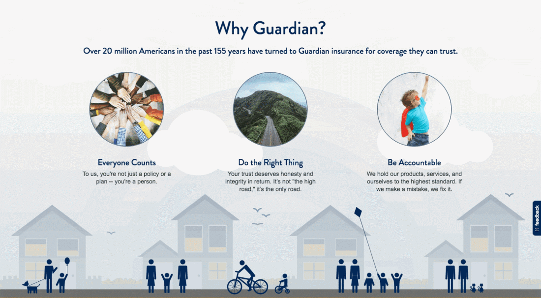
Why Guardian? component background illustration.
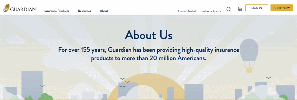
About page hero component background illustration.
Custom Iconography
Regardless of which direction was chosen, we knew early on that custom iconography would play an important part throughout the completed site. During the early phases of the project, we made use of free icons from around the web as placeholders in order to quickly gauge the style and tone that would best suit the project. Once the final Style Tile was approved and we started to work through the design, the icon style we needed became clear. We began to create a custom icon set for Guardian.
Throughout the icon development process unique identifiers were created for each of the 4 insurance products (Dental, Accident, Critical Illness, and Pet), which included a variety of needs:
- a variety of health conditions related to each of the products
- the different content types that would be included
- utility functions of the various tools and processes
- and even a special icon set to be used within their “member portal”, which was being developed independently from this project.
The product icons were also used to create a library of repeating background pattern “wallpapers” for different components and sections of the site.

A selection of the custom icons developed for Guardian.


Light and dark repeating background “wallpaper” patterns. These were created for all four insurance products – Dental, Accident, Critical Illness, and Pet.
Component-driven Design
While we spent time generating page layouts in the form of both wireframes and mockups, our overall approach followed a component-driven, or Atomic Design, methodology. We started by defining the most basic elements – or atoms and molecules and even a couple of organisms – in our Style Tiles. Then throughout the wireframe and mockup exercises, we defined the various reusable components – or organisms – to be used throughout the site’s templates and pages. As the design of these bits and pieces became finalized, our Front End Development team began to build the living style guide using a tool called KSS-Node. This style guide serves as documentation of all the elements, components, and assets that are used to build different pages and sections of the site. Along with a visual representation, example markup is also included.

Screen grab of KSS-Node living style guide.
Conclusion
At Mediacurrent we work hard to ensure our processes are insightful and collaborative. As a remote team, we make sure that our lines of communication are always open which allows us to gain perspective from all disciplines – digital strategy, back end development, front end development, design – without any barriers. This well-rounded approach enables us to design user experiences that not only delight visitors but also increase ROI and perform reliably.
With a bright new look and an unclouded view into the behavioral analytics of their new customers, Guardian can see clearly now. We look forward to further optimizing and improving the user experience together!