It’s been said that a picture is worth a thousand words. In the digital age pictures, emoji, and icons are worth that and so much more. Emoji are considered by some to be the new body language. Google recently scrambled to fix a hamburger emoji that had the cheese depicted below the burger, a clear-cut culinary catastrophe and a faux pas that competitors Apple and Microsoft had not made.
It may seem to border on (or even exceed) the ridiculous to make adjusting a single errant emoji a company’s top priority, but users have strong feelings about this sort of seemingly negligible detail. These feelings don’t usually surface until someone pulls the rug out from under their comfortable experience, like Spotify did when it changed its icon’s color to a slightly different shade of green a few years ago, causing an uproar.
Emoji, and their cousin, the icon, are a big part of our digital lives whether we like it (or realize it) or not. These ubiquitous little buggers can charm and delight us or lead us dreadfully astray.
Why do icons matter?
There are a lot of uses for the noble icon out there in the digital world. At their best (and their simplest), icons are quick visual summaries of complicated concepts that make it easier for users to perform interactions with applications such as activating functionality and with content such as scanning text.
Users are busy and brains aim to be efficient by ignoring unnecessary items. So as UX designers, we aim to make their experience as clutter-free and comfortable as possible. Icons are a boon to this goal when used with discernment.
Why was it important for Mediacurrent to have our own icon library?
When redesigning mediacurrent.com, we knew we wanted to communicate succinctly and memorably to our audience, in a fresh voice reflective of our newest passions and the latest things we’ve learned. Freshly minted, custom-drawn icons were a key part of displaying our uniqueness as well as our values.
“Details matter, it’s worth waiting to get it right.”
- Steve Jobs
Just like the packaging design for the iPhone, or the detailed stitching on a good pair of jeans, attention to detail sends a distinct set of messages: We are passionate about what we do. We care deeply about the quality of the work we produce. We think it’s worth taking the time to do it right.

Another one of our core values is displayed proudly in an individual icon. The icon we created to represent “culture” is an abstract representation of a team of rowers. This analogy is well known within our company, as our success comes from teaming up and working closely together.
What was the process like?
We approached this internal work much like any other design project, in fact! Beginning with a miniature discovery phase we covered the following bases.
Gathered technical, functional specs. The icons were to be used not just on the website by developers and content editors, but by marketing and sales professionals in presentations and reports. What size and type of icon files would suit all of their needs and ideally, make their jobs as easy as possible?
Created and trialled prototypes. Various export files were produced and tested in the applications they were destined for to assess factors such as resolution, scalability, and the ability for users to easily change the color of the icons.
Performed usability testing. Once a concept for the export formats was determined, a small set of icons was generated for testing by a representative group of the end users themselves. Based on these prototypes, the users affirmed the design direction as well as the functionality of the icons.
Itemized deliverables. A full list of icons needed was created, complete with references to previous ways we have illustrated these concepts, and inspiration for possible new ways we could go about it. An hours estimate was created for the work, and resources were allocated to the task.
And now...the fun part!
Once a solid process had been validated, it was full steam ahead. The icons were lovingly crafted in a state of flow in Abode Illustrator using the pen tool. You can experience this nerdy “rush” yourself by playing The Bezier Game!
Of course, no creative project would be complete without peer review. We are very fortunate here at Mediacurrent to have a robust collection of brilliant folks from designers to digital strategists to marketing experts to many developers with backgrounds in design. We are committed to being available for each other for quick reviews any time a colleague is stuck or just wants general feedback. This is the kind of supportive environment in which excellence thrives.
Happily ever after
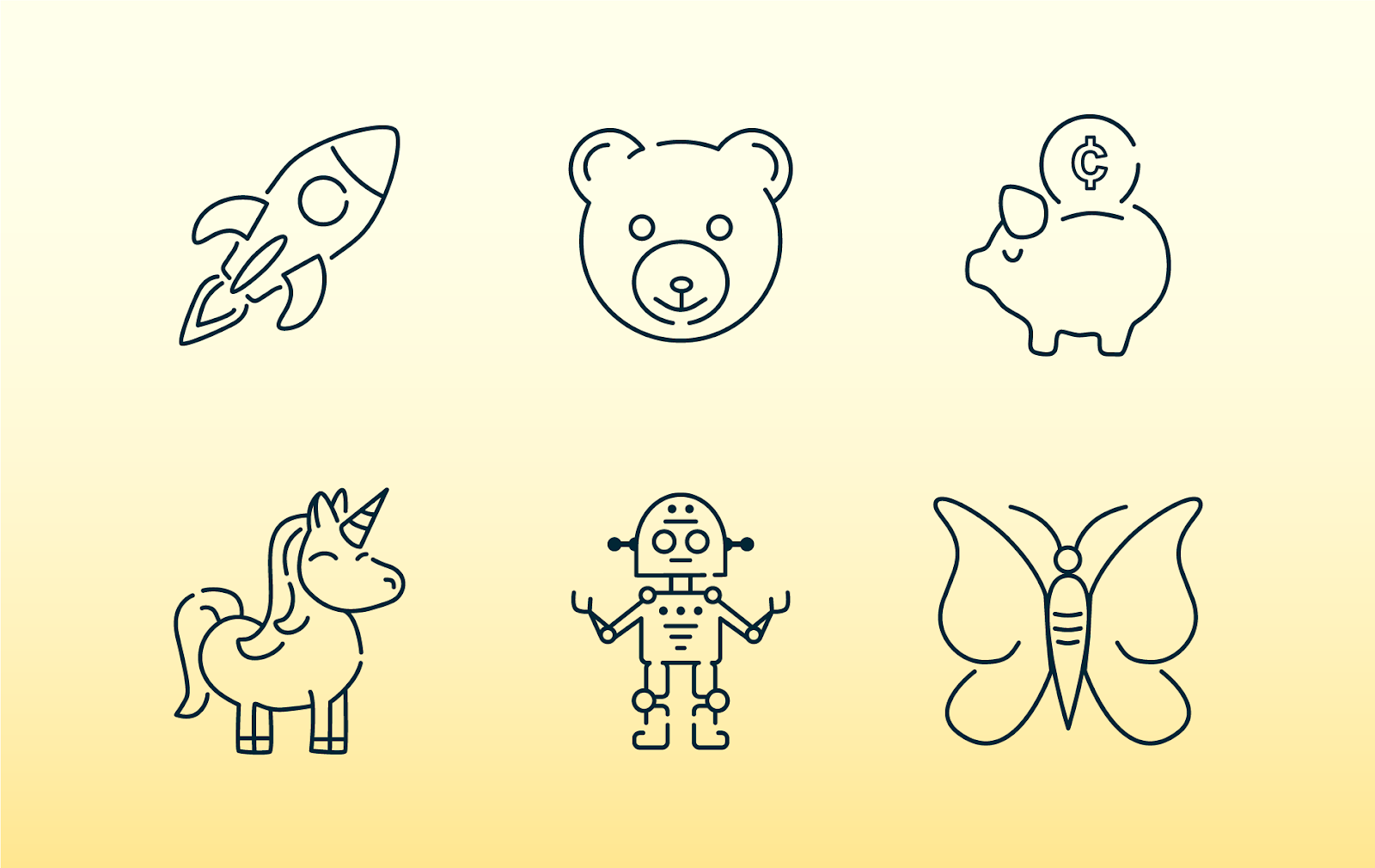
The icons stacked up steadily and now feature prominently in Mediacurrent’s latest sales and marketing materials as well as on our redesigned website. Favorites include those whose inspiration came from the realm of science fiction, fantasy beasts, and playthings.
What’s next for the icon library?
It’s not the end of the story for these icons! While they (thankfully) are not likely to have lives of their own like some emoji, we will continue to add to our set. We plan to release it under an open-source license on GitHub and will gladly take requests from the community for additional icons they might need as they use these in their own projects.