Recently, The Guardian Insurance Company made the strategic business decision to start marketing and selling their products directly to consumers. While Guardian has been around for nearly 160 years (WOW!) most consumer experiences with their products stem from employer insurance coverage offerings. As the industry landscape evolves and the US workforce moves slowly towards distributed and independent employment Guardian endeavored to differentiate their offerings not only from industry stalwarts but also from up-and-coming, startup-like products catering to the same demographics. Mediacurrent was proud to be chosen by Guardian Insurance Company as their Design and Strategy partner during product development of their new direct-to-consumer website.
Now that the site has launched, we’re happy to share some behind-the-scenes details of how this fresh, new experience came together. While our Case Study gives a broader overview of the project, this blog post will provide additional insight into our data driven design process.
Part 1 of this 2-part series covers the early planning parts of our process including Strategic Design Discovery, Style Tiles, and Wireframing. Part 2 covers Mockups & Visual Design, Custom Illustration, and Custom Iconography. Let’s dive in!
Strategic Design Discovery
A Discovery phase begins many of our projects at Mediacurrent. This phase is led by a cross-functional group of our world-class team to help frame the challenges ahead. Throughout this phase, comprehensive knowledge of the Guardian brand, its customers, its competitors, and its business were gathered. These strategic design discovery insights allowed us to understand the types of consumers the new product is being geared towards (user personas), how success is being measured (Key Performance Indicators or KPIs), the ways in which a person becomes a customer (conversion paths) and a boatload of other data that served as our “guiding light” throughout the process.
Style Tiles
Early on we began creating Style Tiles that took the brand’s existing visual guidelines, placed them in an interactive digital context, and expanded on them where we saw the need and/or opportunity. This process created a high level view of the visual tone of the new website. Adding a bit of complexity, Guardian was deep in the midst of a larger corporate rebrand when our project began. In this case, we had to consider the existing brand guidelines, be flexible enough to incorporate new brand elements as they were provided, and ensure that the digital experience was coherent, unique, and accessible to all users – a critical concern identified during Discovery.
Three concepts were presented initially:
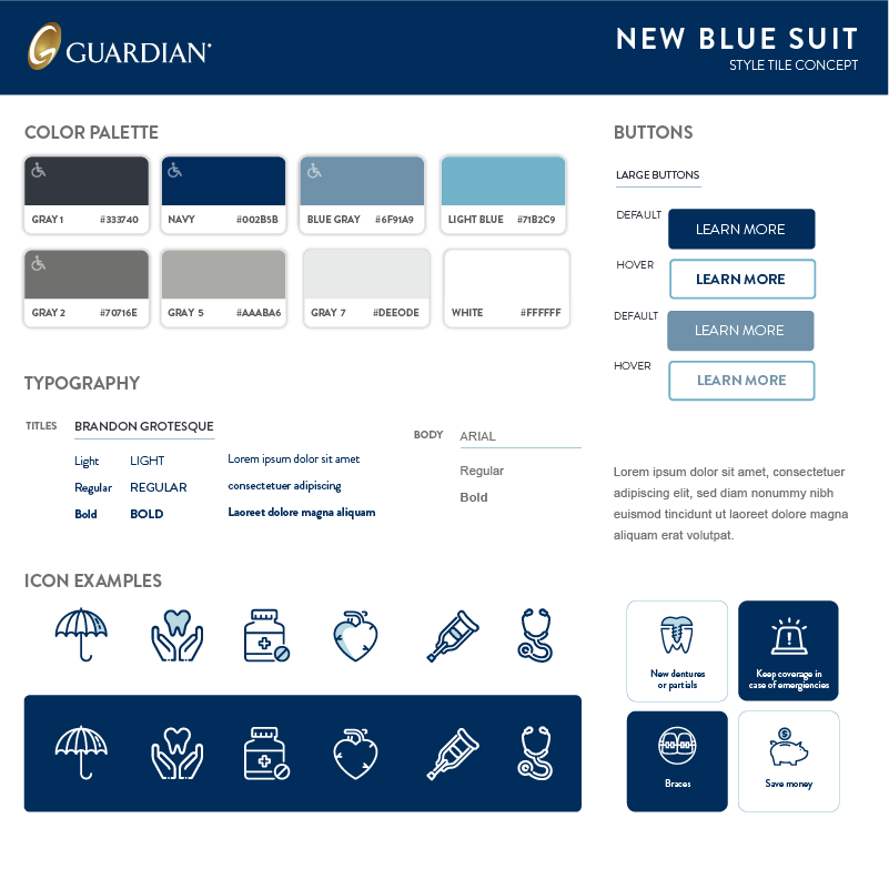
1. New Blue Suit
– This concept expresses subtle sophistication through the use of color, typography, and whitespace. It relies heavily on the brand’s primary blue hue as a color that reinforces trust, loyalty, and integrity. An overall contemporary, minimalist approach is suggested as a means of reducing cognitive load. The icon style followed these principles as well by choosing an outline style with subtle monotone accents. Typographically, we included the fonts defined in their brand guidelines in order to maintain consistency with existing materials.
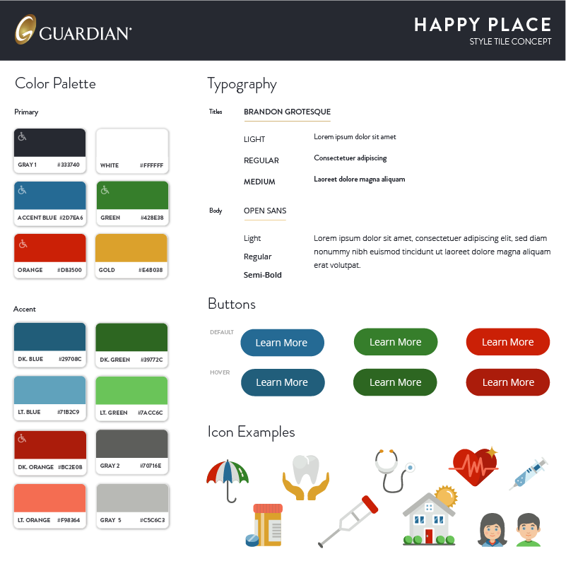
2. Happy Place
This concept is lively and pleasant using bright colors to create a friendly experience. We expanded the brand color palette to add cheerful, accessible hues able to be used in a variety of UI elements. Typographically we pushed the existing brand guidelines by incorporating a new font – Open Sans – as its wider variety of weights allows it to be used more expressively than the currently defined Arial family. Our type treatments utilized a lighter weight body font to balance the heavy use of color and maintain valuable whitespace. The icon style suggested takes a more fully-realized illustrative approach making use of the expanded color palette and adding dimension through highlights and shadows.
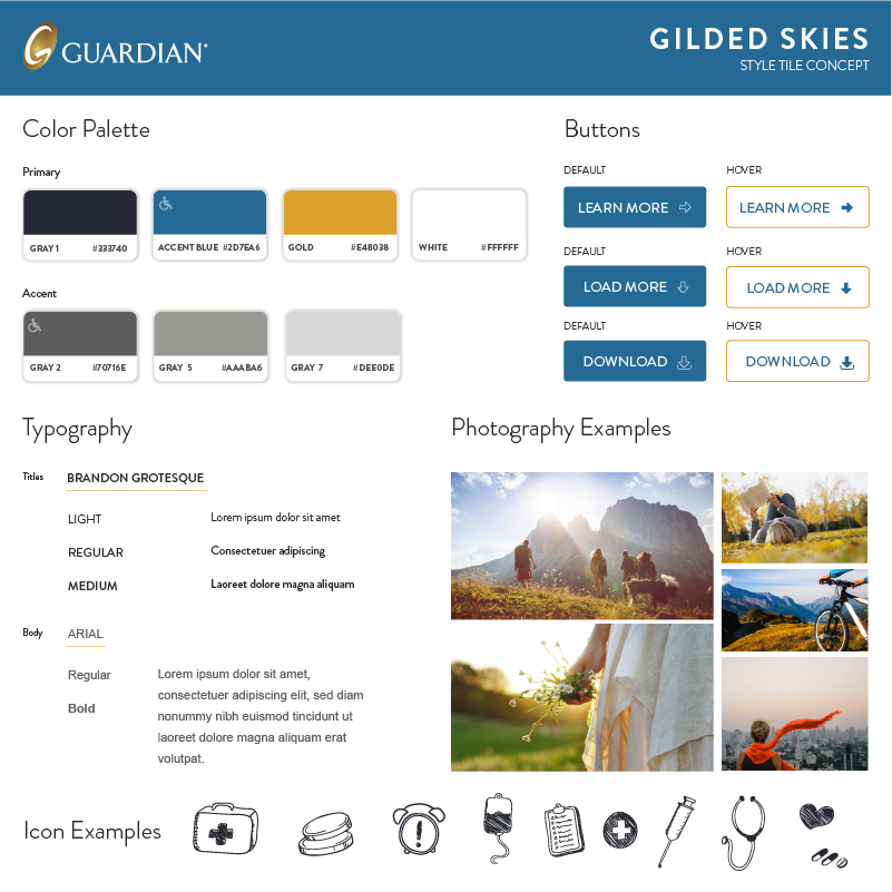
3. Gilded Skies
This concept reduces the color palette and adds trendy accents. Broader than New Blue Suit, but more restrained than Happy Place, this example’s color palette features a rich gray, trusted blue, and adds shades of gold to suggest value, elegance, and quality. Here we’ve suggested a hand-drawn icon style that personalizes the experience with a more genuine feel. We also included photography style suggestions that feature color and light effects to extend the color palette and maintain a clean and crisp look.
Through this exercise, we were able to understand just how far Guardian was willing to push their existing brand and create a final document that was approved by all stakeholders as the visual voice we wanted to achieve with the final product. In the end, and with a few iterations in between, we landed on what was essentially a blend New Blue Suit and Gilded Skies as the path forward. This final Style Tile was chosen in order to maintain consistency with Guardian’s larger, existing brand guidelines while introducing elements that would help create a more casual tone appropriate for the demographic of their direct-to-consumer offerings.
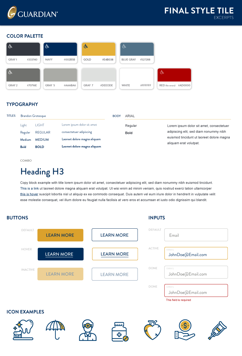
A sample of the final approved Style Tile.
Wireframes
Next, we moved on to really digging into the user personas and conversion paths generated in the Discovery phase by creating wireframes for the different sections of the site. One of the most exciting parts about this project was that we were not only designing the marketing section of the site but also the entire customer experience from the point where the visitor is attracted, becomes a lead, and eventually converts to a customer. This means that in addition to top-level marketing pages – like the home, about, and product pages – user journey designs were also needed for getting a quote and enrolling in one or multiple products.
Throughout the wireframing process, we broke down the different types of pages and sections of the site that users will encounter when visiting and organized the placement of content and calls-to-action (CTAs) by mapping the layout structure to the user journeys and KPIs identified in Discovery. Working from the Mobile First perspective, we made sure to consider this hierarchy not only on desktop machines but also tablets and mobile phones. In this case, we decided to take a medium fidelity approach – meaning that we avoided color or imagery in order to maintain focus on content organization and the user journey. We did include the typographic and iconography styles defined in our approved Style Tile, and we simulated actual copy since the process included quoting and checkout workflows which would not have made sense with greek copy.
In the end, these blueprints ensured that the user experience was providing the clearest path for a visitor to learn about the products, understand the cost and coverage offered, then ultimately enroll in a Guardian Insurance plan.
The goals mapped through the top-level marketing page wireframes were not only to educate the consumer about the company and the products offered but, more importantly, to serve as a hassle-free gateway to the actions the business measures – namely generating a quote and enrolling. On the homepage, Guardian wanted to make sure a newly developed brand message – Life is full of surprises. The cost of paying for them shouldn’t be. – was clearly communicated so we even started to play with some interaction suggestions.
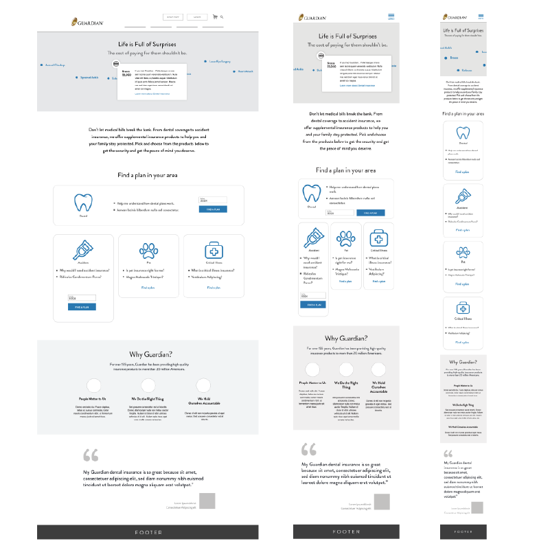 Desktop, tablet, and mobile homepage wireframes.
The goals mapped through the quoting experience provided a simple way to understand the cost and coverage offered for a variety of different types of consumers – single person, couple, children, adult dependents, etc.
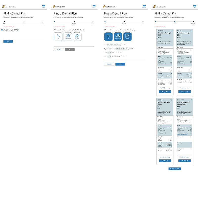
Tablet-width wireframes of the Find a Dental Plan (or quoting) process.
The goals mapped through the enrollment/checkout process were to
a) keep the experience as simple and logical as possible for all types of visitors;
b) allow them to enroll in one or multiple products at the same time;
c) gather all legally required information and consent – which varies between products.
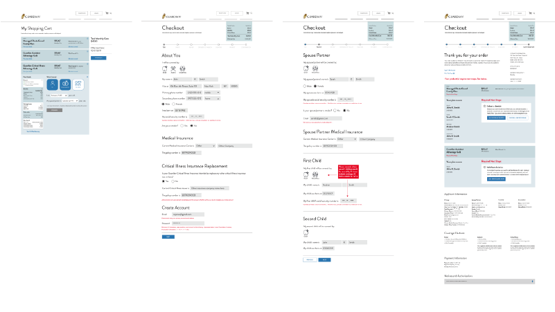
Desktop-width wireframes of the Enrollment (or checkout) process.
Along with these broader page-level experiences, microinteractions – such as saving and retrieving quotes – were considered and wireframed to ensure that the experience was cohesive.
Stay Tuned!
Our process does not end here but part 1 of this post does, unfortunately. Check out part 2 where we dig into the visual design details of the site! We look at different visual concepts that were created, how the design was finalized with custom illustrations and iconography, and the component-driven approach we follow.