
For this nonprofit, establishing a web presence to inform and inspire users required a blend of analytical and creative disciplines across Mediacurrent’s digital strategy, design, and development teams.
Achieves a nearly perfect score for mobile UX site speed from Google
The percentage of visitors using the site search function; a testament to the UX and navigation menu that effectively addresses users informational needs
The bounce rate is consistent across all devices and outperforms the industry average of 70% for advocacy groups
CARE, a leading international humanitarian organization, established CARE Action! to support its core mission, advocating for the world’s poor by influencing policymakers. Ready to branch out and live on its own domain with independent advocacy messaging and membership conversion goals, they partnered with Mediacurrent to launch a new website, leveraging a targeted content strategy to drive membership and donations.
Mediacurrent facilitated website strategy sessions to drive action and engagement with petitions as well as state and national advocacy campaigns. We also shaped organizational and membership goals by guiding end-to-end membership strategy for CARE Action! Network, determining that paid membership was the best option given their audience and fundraising goals.

The CARE Action! Network project went through Mediacurrent’s full strategy process from initial Discovery all the way through to post-launch support, including a Creative Brief, Landscape Analysis, Personas, Content Audit & Gap Analysis, and SEO audit. While CARE's audience is humanitarian based, the core audience for CARE Action! is rooted in political activism. Audience research validated that this appeals to a younger audience, underscoring the importance of a high-performing mobile site experience and emphasis on social engagement.
Custom analytics and goal tracking were also implemented, providing a clear window for CARE Action! Network to track ROI, ensure their goals are being met, and guide future usability and content initiatives. Finally, key performance indicators such as increased email acquisitions were documented to serve as a benchmark for measuring future improvements.
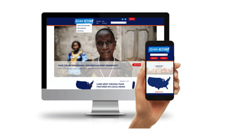
Mediacurrent was challenged to create a distinct design that allowed CARE Action! Network to clearly articulate their organizational objectives, voice, and audience, all within CARE’s brand guidelines. User personas guided most layout and content placement decisions through the design process. The new site delivers resources such as contact information, events, news, and more on a state-by-state basis, encouraging users to participate and take action in their home state.
User personas were created to to understand the desired online experience of real decision-makers who visit the site. To make an emotional connection, the design puts images and video at center stage. The use of high-impact mixed media packs a stronger punch than text alone, reaching activists and skeptics alike.
With a call-to-action and content focused design philosophy in mind, Mediacurrent designed a clear and simple site architecture. Organizing many links in the flyout menu as anchors to the same page provides ease of navigation, higher content visibility, and marketing opportunities.
In addition to the flyout menu that provides anchors to frequently accessed content, encouraging easy click-through was also accomplished 'highlight' components (some include videos, others a direct link to that content). Our 'card' approach provides a summary with a bit of relevant information before asking the user to access another page.
Several UX and design strategies were employed to optimize mobile traffic, with a spotlight on calls-to-action that inspire and lead users down a path to become members and donate.
- A simple, intuitive interface encourages visitors to click through to another page and easily find what they’re searching for.
- Features like a back-to-top indicator when scrolling and finger-friendly action scripting for each campaign graphic quickly brings the summary onto the screen.
- The small screen design doesn’t cut corners on targeted content and functionality. For example, the clickable map feature that appears on the desktop version to highlight advocacy news on a state-by-state basis translates to an automatic rotator on mobile. This feature shows potential members how their donation will make a difference, delivering a consistent website experience across all devices.

We critically assessed the donation pages of four major advocacy organizations to build a high-converting page:
- A “donate” button, featured prominently in the top navigation bar, provides easy access to donate from all entry pages.
- A simple and intuitive form and page design collect donations in just one step, reducing drop off.
- Responsive design = donations on any screen size.
- Clear branding and fast page load times increase conversion rates.
- Multiple Calls-to-Action on the donate page grab the user's attention

To accommodate a tight deadline, the site was developed in phases. This methodology helped to prioritize the most critical features for launch and continues to allow for growth over time. Ultimately, CARE Action! Network realized the benefit of partnering with an open source and Drupal-centric agency for full service development, strategy, and creative. Planning the site from all these disciplines lead to a final product that stands out in the hyper competitive non-profit space. With design and development in sync with strategy, Mediacurrent’s Drupal focused creative team delivered design mockups that were an accurate representation of the CMS functionality. This provided a level of insight went beyond what a generalist designer could accomplish and set expectations early in the project.