A few months ago I wrote about how combining the picture element module with the breakpoints module can help you manage images in a responsive Drupal 7 website more efficiently. As a follow up, I wanted to write about how Responsive Images has evolved within the Drupal ecosystem. This time however, the focus will be on Drupal 8— though most of what I will cover also applies to Drupal 7 with some minor differences.
There are two noticeable changes in Drupal 8 related to Responsive Images
- The picture element module is now called Responsive Images
- Both Responsive Images and the Breakpoints module are part of D8’s core (they are contributed modules in D7).
In earlier versions of the Responsive Images module (D8), and Picture module (D7), the only option for serving different images to different devices was to use the media attribute, which meant using media queries for detecting the device size. Although this works pretty well, the device’s size alone should not be the only criteria for serving images. The scenario that always comes to mind for this technique is that if I am using a laptop with a poor or unreliable wifi connection, I will still be served a large or high resolution image because my screen size is large. Wouldn’t it be nice to be able to detect other conditions when determining which image to serve to a device? Conditions such as connection speed, viewport size and screen density? Even better, wouldn’t it be nice if you could provide the browser with information about your images that normally would be unknown to the browser?
One of the biggest issues with images is the fact that the browser does not know the size or rendering information in relation to the viewport until the images, CSS or JS are fully loaded. Browsers can’t know anything about a website that they haven’t loaded yet. But they’re constantly aware of the environment they’re rendering within: the size of the viewport, the resolution of the user’s screen, that kind of thing. The idea of media queries is this: let web developers do specific things for specific environments. If the viewport is wider than a thousand pixels, then show the sidebar to the left. Otherwise, push it below our main content. If the user’s screen is retina, then use a big image. Otherwise, use a smaller one.
When using media queries alone, we are still telling the browser what image to serve based on the device size. It’s time we provide the browser with options and let it make the decision.
Identifying the gap between what the browser knows and doesn’t know at time of rendering:
| Variables | by the author when he or she is writing the code? | Known by the browser when it's loading the page? |
| viewport dimensions | no | yes |
| image size relative to the viewport | yes | no |
| screen density | no | yes |
| source files' dimensions | yes | no |
As you can see from the table above, the browser is aware of viewport dimensions as well as screen density. However, the browser is not aware of how large images need to be rendered in relation to the viewport, or the actual physical file dimensions.
Starting with Drupal 8 Beta 15 (it could have been before, but this is when I first learned about these new changes), the Responsive Images module provides more options for determining which image to serve. These options include the srcset and sizes <picture> element attributes.
srcset
With the srcset attribute provided by the picture element, we can provide the browser with a collection of images to choose from. Unless you are doing art direction, srcset is ideal for resolution switching based on display density as well as for width descriptors. By letting the browser make the decision, the browser can detect environment conditions we are not able to such as network conditions or user preferences.
Example of display density which is a use case for resolution switching:
<img srcset="drop.jpg, drop-2X.jpg 2x, drop-3x.jpg 3x, […], drop-16x.jpg 16x">In the example above we can serve different images based on the screen density. One quick note, display density descriptors are best for fixed with images.
Example of using srcset with image width descriptors:
<img src="drop.jpg" alt="drop"srcset="drop-160.jpg 160w, drop-320.jpg 320w, drop-640.jpg 640w, drop-1280.jpg 1280w">When you use width descriptors, you’re providing the browser with a list of images and their true widths so that it can select the best source.
sizes
With the sizes attribute we can tell the browser the size of the image in the page so it can download the right source from the list of images provided in the srcset.
If you are using the srcset width descriptors, the sizes attribute is required. Like srcset, the sizes attribute contains a comma-separated list. This comma-separated list describes the size of the image in relation to the viewport. See example below:
<img src="drop.jpg" alt="drop" srcset="drop-160.jpg 160w, drop-320.jpg 320w, drop-640.jpg 640w, drop-1280.jpg 1280w" sizes="(max-width: 480px) 100vw, (max-width: 900px) 33vw, 254px">Like srcset, each comma separated item has two values: Media conditions and Lengths.
- Media conditions: A media condition is similar to a media query, but not as full featured.
- Lengths: The lengths value is usually represented using the viewport width (vw) unit. Each vw unit represents 1% of the viewport width, (i.e. 100vw is 100% of the viewport width and 33vw is 33% of the viewport width). The length doesn’t have to be expressed as a viewport width unit. It can be any length including absolute and relative length.
You may be wondering, how does this help or how is this different than just using the <picture> element? Let’s take a look at our table above now that we can provide the browser with more information than before:
| Variables | Known by the author when he or she is writing the code? | Known by the browser when it's loading the page? |
| viewport dimensions | no | yes |
| image size relative to the viewport | yes | yes via sizes |
| screen density | no | yes |
| source files' dimensions | yes | yes via scrset |
As you can see sizes and srcset attributes now close the gap that existed before and now the browser has all the information it needs about our images before it loads them so it can pick the best one for any given scenario.
To put this into practice in D8, we are going to work with a hero image that always expands 100% the viewport width on any device.
These are the steps for configuring Responsive Images in Drupal 8:
1. Defining Image Styles
- Go to admin/config/media/image-styles
- Click Add Image Style and create as many styles as you need. For this example, I have created the following image styles:
- Hero large: 2000 x 600
- Hero medium: 1200 x 400
- Hero small: 600 x 200
2. Defining Responsive Image Styles
- Navigate to admin/config/media/responsive-image-style and click Add Responsive Image Style.
- Label this responsive image style set Hero.
- For Breakpoint group choose <your theme>. If you have declared your own breakpoints in yourtheme.breakpoints.yml, you will see those listed here.
- Pick a Fallback Image Style for when things go wrong. Because the browser support for picture element is so good, when combined with Picturefill, the only time a fallback image will be needed is if there is ever an error.
- Press Save. Your options will be saved and you will be presented with the options to configure your image settings.
3. Mapping Responsive Image Styles with a Breakpoint group
- Sizes vs Image Styles: While you have the option to provide only image style per breakpoint, we are going to use “Select multiple image styles and use the sizes attribute”
- Under the sizes field, let’s type 100vw. This means, the image will be render 100% the viewport width.
- Select the original image styles we created on step 1 above (Hero large, Hero medium and Hero small). See screen 1 below.
- We repeat these steps with each of the breakpoints we have declared.
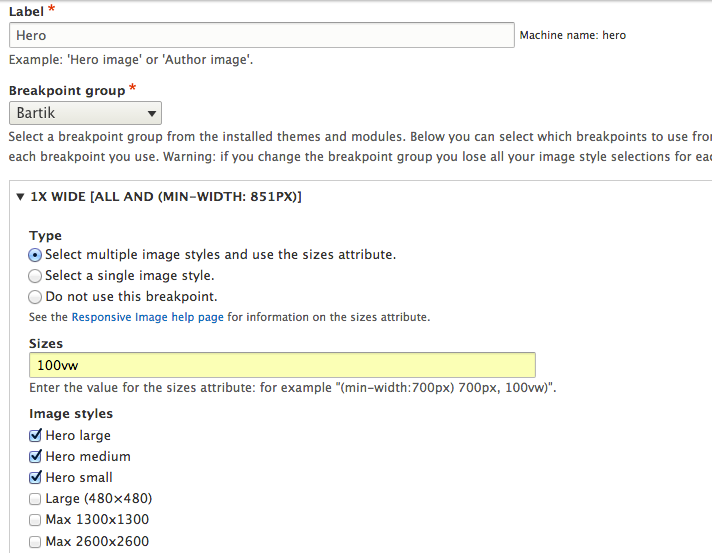
Screen 1.
If I have specified different multipliers on THEME.breakpoints file (1.5x, 2x, etc), I will have an option to provide image styles for images that are larger than normal for high density/resolution screens.
4. Using Responsive Image Styles in Image Fields
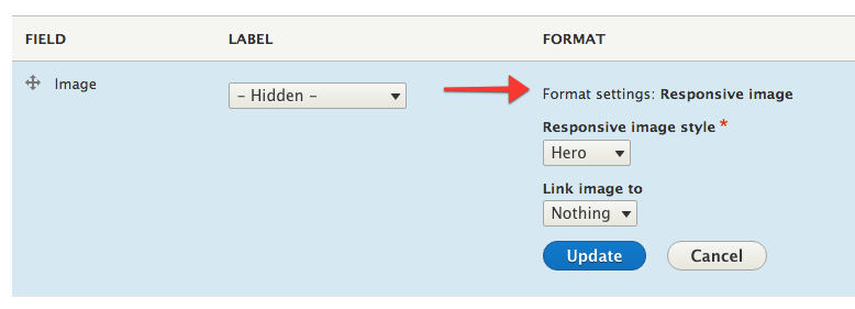
In order to start taking advantage of our configuration above, we need to configure the image field which will contain our hero image. In my case I have created a content type (Hero), which simply uses an image field. I need to change the display settings on that field as follows:
- Go to admin/structure/types/manage/xxxx/display (where xxxx is the content type name)
- Hide the label
- Change format from Image to Responsive Image
- Select Hero as the Responsive Image Style, which we created in step 2 above.
- Click Update. See Screen 2 below.
Screen 2.
Author's note: I recently presented on this topic at Bay Area Drupalcamp 2015. The presentation recording is now available, below. Updated 11/2/15.