If you’ve ever talked to someone who’s performed an accessibility audit you’ve heard us go on an on about the need for manual testing. Each of us loves the automated tools available that help make the web more accessible, but there are limitations to those tools: only 20-30% of errors can be reliably found with automated testing. They may generate false positives as well. When it comes to accessibility testing, you need to include the human element in the testing process.
Okay great! You’re on board, now what? Well in this post we’ll cover the three “Must Do’s” of manual testing.
Keyboard Only Navigation
Required Tools/Software: A keyboard
Users of assistive technology, as well as power-users, may only use their keyboard to navigate your website. Help them avoid “keyboard traps” by testing the site out yourself first. Use your tab, arrow, space, shift and enter keys to explore your website.
Here are a few things to look for:
- Do you have a “skip to main content” link at the top of the page, before your navigation? This prevents users from having to go through your entire navigation over and over again just to get to the main content of your page.
- Are your menus/mega-menus navigable?
- Some menus are not accessible without a mouse.
- Are you able to access the different sections of your page with only a keyboard?
- Don’t let your users miss out on valuable content!
- Are links and form fields brought into focus (meaning do you see an outline around links and do you see a cursor in form fields)?
If the answer is no to any of the above, bring your development team into the fold. Each of these issues can be corrected.
Test with a Screen Reader
Required Tools/Software: A keyboard
Third Party Resources: screen reader (options include - Mac: VoiceOver, Windows: JAWS, Browser: ChromeVox)
Non sighted users typically use screen readers to interact with your website. Though Window’s JAWS is the most popular there are several screen readers available for you to test with. Each will have slightly different controls so I’d recommend you start with one and learn to navigate that first - you can always keep learning from there.
Enable your screen reader and adjust the speech speed to your liking. I have mine set to something much slower than a native user is likely to have as I do not yet have my ears trained to work as quickly as they do. The speed isn’t important - it’s that you’re testing that counts!
Once your screen reader is enabled go to the browser of the site you’d like to test - then stop using your mouse! I often find it helpful to close my eyes and try to navigate the site using only my keyboard and the screen reader technology.
Here are a few things to listen for:
- When announcing the link to home typically associated with the logo on the site - are you able to tell where the link directs you from what it being said? What about other links: does what is read to you give context as to where it will lead?
- If there is more than one menu, are you able to tell which menu you are on and what link you are on within that menu?
- For all forms, are you able to tell what information is expected of you when you are asked to input text (i.e. does it speak something like “enter search terms”)
- Is all of the on-page content read to you?
- Does the alternative text of an image give appropriate context as to what the image is about/its value to the overall story?
There are other benefits to listening to your site too: you’re more likely to catch redundant or poorly crafted content when you’re forced to listen to it and not skim it visually.
If you find any areas of concern, do your developers a favor, take a short video of the problem as the screen reader presents it. This can be accomplished with browser add-ons such as Screencastify Lite. And be sure to include your platform, browser and screen reader in your report as well. These tools will allow them to see what you are seeing and to recreate the problem so that they can troubleshoot it faster and more effectively.
Double Check Your Colors
Required Tools/Software/URLs:
Third Party Resources: photo editing tool or browser add-on that enables you to grab the Hex values of colors on the screen (Options can include - ColorPick, Adobe Photoshop) and a color contrast testing site (I recommend WebAIM’s Contrast Checker)
Automated testing can run amok when checking color contrast. Now don’t get me wrong: automated testing is a HUGE help with this and should definitely be used! The downside is that some of these will not see images over the background.
Let’s make up a hypothetical component as an example. For our purposes let’s assume that the automated test in question has determined that your component's background is white, and your text is a dark gray. Under normal circumstances this combination would have a high enough color contrast to be compliant. What the automated test may miss is that there is a medium blue image that is on top of that white background but under the gray text. The end visual would then produce dark gray text on top of a medium blue background. In this example, the end result would not have a high enough color contrast ratio.
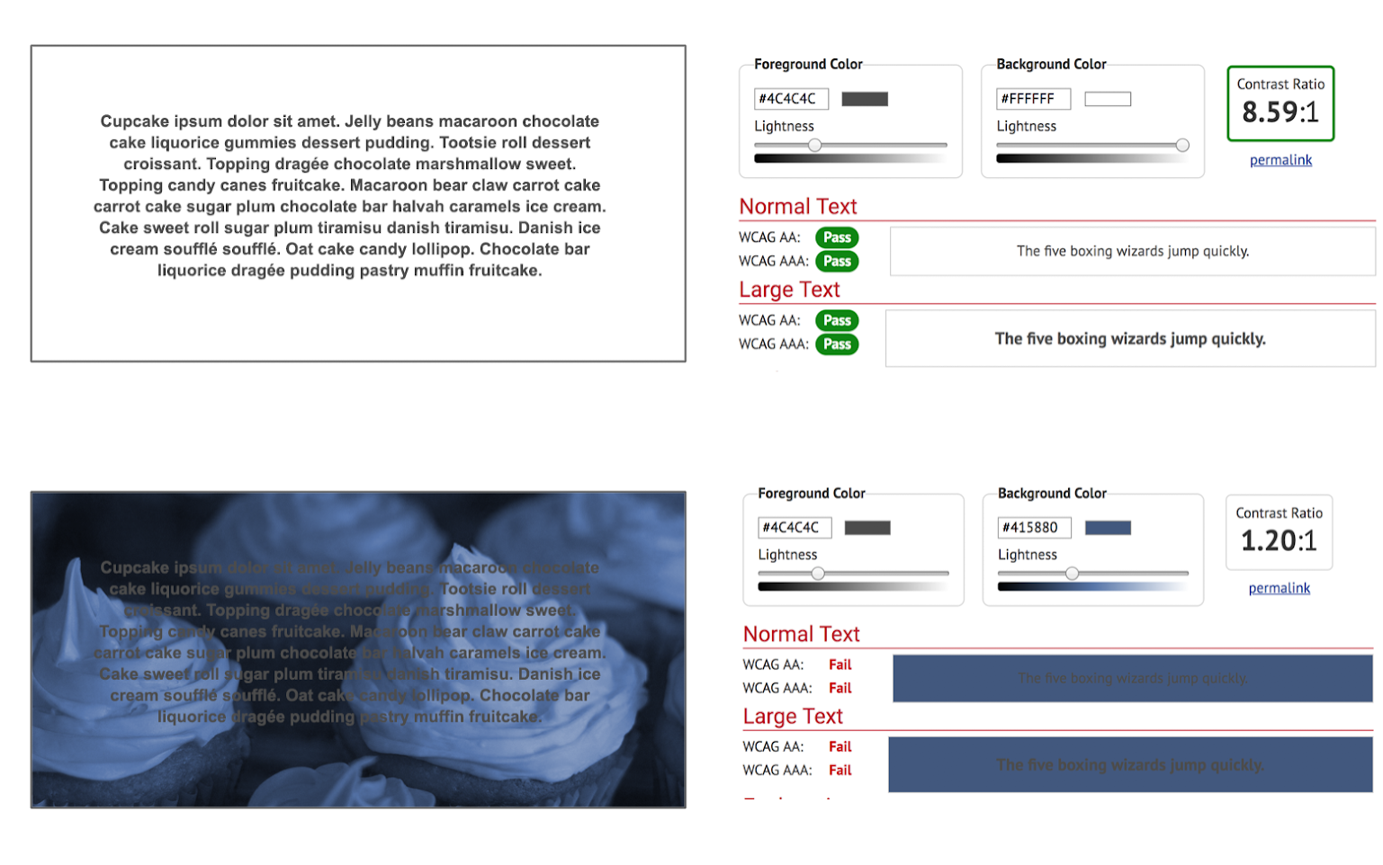
How to test this manually:
- Look for areas that do not obviously have a high color contrast ratio -it’s best to test 10 things that pass than miss something that does not.
- Either using browser tools or testing screen shots in a program such as Photoshop, grab the foreground and background colors.
- Enter these into the respective fields on the Color Contrast Checker webpage
- Look at the font size in question and determine if it is a pass or fail
For any fails it may be helpful to either suggest an alternative color to your dev team or bring in a member of your UX team to ensure that your colors are both compliant and on-brand.
Your Content is for People
Good content and SEO strategy says you write for people and the machines will follow. Accessibility follows this same principle: people need to test to determine if your site is usable by people. Your website is a powerful resource for your team: allow all of your users to take advantage of all it has to offer!