Building features into a project from the start is almost always cleaner, easier, faster, and less expensive than retrofitting after the fact. It's no different for building accessibility into a website. Fortunately, much of this accessibility "base" is simply a matter of building according to standards and following best practices. First, let’s take a look at the difference between how a sighted and non-sighted user might browse a website.
How we build a site affects how assistive technology users can access a site
Sighted users typically can determine and process the contents of the page simply by the design - the use of space, color, dark/light contrast, size, etc. - and automatically and immediately divide the page into relevant and non-relevant information at a glance. Non-sighted screen reader users don’t have this luxury. They can either have the entire page read to them from start to finish in source code order (lengthy and inefficient!) or they can browse the page through its structure and aggregated lists of element types.
For example, a screen reader user might visit a site and know they want to search the site for specific contents. Or maybe they just want the contact info, which often resides in the footer of sites. For these scenarios, they’d likely bring up a list of the page landmarks to see if they might be able to quickly jump directly to the appropriate section.
(For the purposes of this article, we’re using a page from webaim.org - http://webaim.org/techniques/hypertext.)
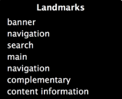
In this page, we have both an HTML5 footer element and a WAI-ARIA role of contentinfo which is the same as a footer.
<footer role="contentinfo">
ARIA always overrides HTML, so “content information” instead of “footer” is listed in the landmarks:
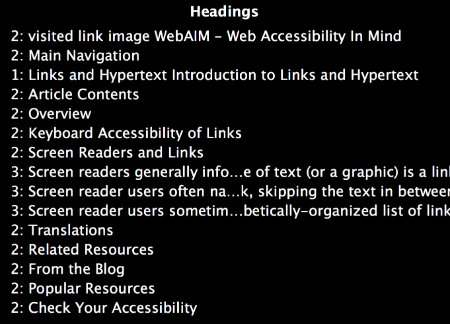
Or maybe they want to get an idea of the contents of the page, so they listen to a list of all the page headings. If something sounds promising, they can then jump directly to that heading and listen to the contents of the heading’s section.
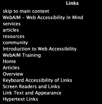
Or if they’re looking for more specific information, they might bring up a list of all links on the page:
They could also do this for form controls, lists, buttons, tables, or a number of other elements types depending on their screen reader settings.
But the ability to navigate a site in this manner depends on how it’s built. If a site is built using “div soup” (using generic div elements instead of appropriate HTML elements) and unhelpful link texts like “more” and “click here” and no headings, etc, a person who is blind is forced to listen to a page from top to bottom to find what they’re looking for. Or they may just abandon the site and continue down the search engine’s list of relevant sites to find the information they seek.
So, how do we build sites that are usable by screen reader and keyboard-only users? By following some basic best practices and guidelines from the beginning of the project.
Use best practices to make your site accessible to the widest audience
Several of these were covered in “5 Things You Can Do To Make Your Site More Accessible.” The following is an expanded list.
Back to basics: validate your HTML
First of all, validate your HTML. Starting with valid HTML markup will simplify things immensely. Use W3C's Markup Validation Service or similar - https://validator.w3.org/
Use semantic HTML elements
Next, use semantic HTML5 elements rather than generic divs to mark up the structure of the page. This will allow the user to navigate directly to various sections of the page as in our earlier landmarks example.
Bad:
<body>
  <div class="header">
    <div class="header-content">Header</div>
    <div class="search">Search</div>
  </div>
  <div class="nav">Navigation</div>
  <div>
    <div class="main">
      <div class="contents">Content Block 1</div>
      <div class="contents">Content Block 2</div>
      <div class="contents">Content Block 3</div>
    </div>
    <div class="sidebar">
      <div class="sidebar">Sidebar Block 1</div>
      <div class="sidebar">Sidebar Block 2</div>
    </div>
  </div>
  <div class="footer">Footer</div>
</body>
Good:
<body>
  <header>
    <div class="header-content">Header</div>
    <div class="search" role="search">Search</div>
  </header>
  <nav>Navigation</nav>
  <div>
    <main>
      <article>Content Block 1</article>
      <article>Content Block 2</article>
      <article>Content Block 3</article>
    </main>
    <aside>
      <section class="sidebar">Sidebar Block 1</section>
      <section class="sidebar">Sidebar Block 2</section>
    </aside>
  </div>
  <footer>Footer</footer>
</body>
Use headings appropriately
Along the same lines, be sure to break the content into manageable chunks and mark it up with proper structural content elements. Use headings (h1-h6) in their appropriate hierarchical order. Avoid divs and spans where more meaningful elements can be used, such as paragraphs, lists, etc. Why is this important? For the same reason as above. A screen reader user often "browses" web pages through their structure. In addition to page sections, they can bring up lists of lists, form elements, tables, etc.
Use native HTML elements over JavaScript or WAI-ARIA
In addition, use appropriate HTML especially for focusable elements (links, form elements, buttons). For example, if you use a div styled as a button instead of using a button element, you lose the button behavior that the HTML button element gives you out of the box. For instance, users of assistive technology expect to be able to activate a button with the spacebar. Using a div styled as a button requires adding that functionality back in with JavaScript which is rarely done. You could use WAI-ARIA so that the screen reader announces your div as a button but WAI-ARIA still does not give the button the behaviors a screen reader expects from an HTML button element. See Steve Faulkner’s excellent article on using native HTML buttons. Use appropriate HTML elements when available.
Maintain a logical tab order
Tabbing through a page will follow the source order of the page. So although the order of your page makes sense visually when the design is applied, be sure the source code is also in a logical order. Be careful when floating elements or using positive values for tabindex.
Label all form controls
When a form element receives focus, the label text connected to that form element is read to the user. Without a form label, forms become pretty much useless to some users. Added text in a paragraph or other tag before or after the form element is not much help. When tabbing from form element to form element, that text is not read. Anything important that a user needs to know to fill out a field needs to be in a label tag.
Describe images with proper alternative text
Images can add a lot of information. Consider the images on this page: http://webaim.org/techniques/sitetools/. Without alt text on the images, the screen reader will either not include the image in a list of images on the page or it will read out the image url as a description. Be sure to include alt text on all but purely decorative images.
Make a “skip navigation” link the first piece of content on the page
A “skip navigation” link should be added as the first piece of content inside the body tags and allows a person to skip directly to the main content of the page. Without it, a person must tab through sometimes long lists of menu links in order to access the main content. Some argue that a “skip navigation” link is no longer needed if a page is properly marked up with semantic HTML. That may be correct for screen reader users but doesn’t take into account sighted users who don’t use a mouse or a screen reader and are forced to tab through long lists of navigation links on every page load. The “skip navigation” link is still very much necessary.
Use descriptive and unique page titles
The page title is the first piece of information read by the screen reader. It can tell a user a lot or nothing about where they just landed. If there is no page title, the screen reader will read the url of the page instead.
Video and audio
Include captions with audio descriptions for video and transcriptions for audio. Captions and transcriptions help not only people who are deaf or hard of hearing but also those with cognitive disabilities. Google loves them too!
Color contrast
People with a variety of vision issues (color blindness, low vision, cataracts, etc.) find it difficult to read without sufficient contrast between the foreground text and background color. Because of this, check your pages with a color contrast checker and never rely on color alone to relay important information. Testing for WCAG’s recommended 4.5:1 color contrast ratio is a good start. This can easily be done with Webaim’s color contrast checker or Web Accessibility Evaluation (WAVE) tool. In addition, a great tool that allows you simulate how your site might look with a number of different vision deficiencies is the Chrome plugin, SEE.
As you can see, building good, solid, accessible websites is not rocket science. A lot of it is just paying attention to best practices. Introducing more advanced web development techniques such as mega menus and javascript widgets and AJAX makes accessibility more complex, of course, but starting with a good foundation by following best practices makes maintaining accessibility with more complex features less of a mountain to climb.